CAROUSEL BY JESSE HAMM
Carousel 025: Close Read: Uncanny X-Men Annual #11
Alan Davis has long been admired by other artists for his appealing draftsmanship and his command of action, humor, and other key elements of superhero fiction. His work is further distinguished by his masterful panel-by-panel storytelling. One particular example of his work that I return to often for inspiration is Uncanny X-Men Annual #11. It’s a great example of consistently clear, effective cartooning—no mean feat for a fast-paced story about ten different characters. Let’s take a close look at a 4-page segment of this story and see what the art can teach us.
The following pages were written by Chris Claremont, inked by Paul Neary, colored by Glynis Oliver, and lettered by Tom Orzechowski. These are pages 13 through 16 in the comic, but for simplicity’s sake I’ve re-numbered them here as 1 through 4.
PAGE 1
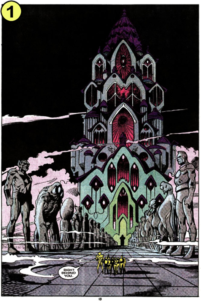
Splash pages in comics should be used sparingly, partly because they slow the narrative nearly to a stand-still, and partly because they use up valuable space that could have been occupied by panels that must find room elsewhere. Nevertheless, Davis (or Claremont) chose to devote an entire page to this show-stopper, in order to introduce the setting which the characters will occupy for the rest of the story.
We won’t see this castle’s exterior again for dozens of pages, so Davis makes it count. He emphasizes the castle’s size by including the characters in the foreground, pulling the viewer back far enough that the figures are properly dwarfed. He also targets their destination—the massive doorway—with converging perspective lines, directing our attention toward where they will be heading for the next page or two.
PAGE 2
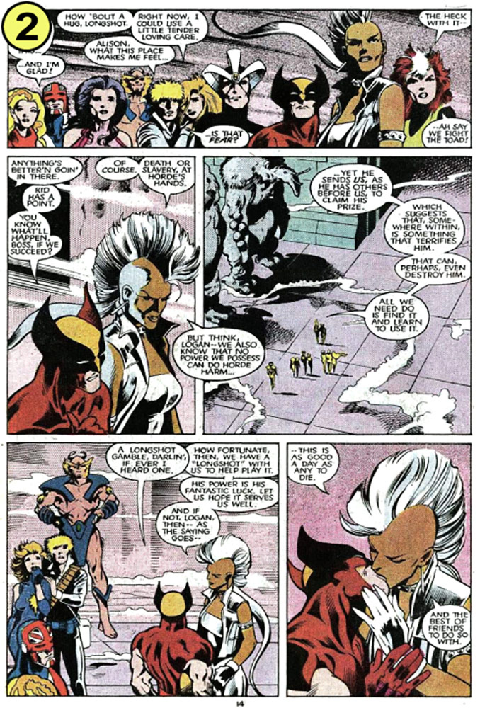
Panel 1
Our connection to characters is bolstered when we see their reactions to key events, so Davis uses a wide-shot here to show us every face on the team. Though Storm and Wolverine have no lines in this panel, Davis places the pair foremost in this line-up, signaling that the rest of the page will belong to them.
Panel 2
Davis moves in to a close-up of our two leads in conversation. A frontal view would not have conveyed motion, so he shifts the viewer to one side, tilts Storm’s arm and earring, and pushes the pair toward the lower-right corner of the panel. These few, smart clues convince us that the pair are walking, even though we can’t see their legs.
Panel 3
Davis pulls back to reemphasize the majesty of the setting. This also helps sell Storm’s dialogue, which is so plentiful here that settling on her face for the entire panel would have drawn our attention to the art’s stillness, making her look like a mannequin. Viewing her instead from a distance helps us imagine that her face is moving and changing expression as she speaks.
The rolling mist adds mystery to the environment, along with a sense of scale, helping the figures appear less like bugs on a kitchen floor.
Panel 4
Davis takes this opportunity to remind us of the presence of Horde, whom Storm was just discussing, and Longshot, whom she mentions here.
It would have seemed natural to include in the background here the giant statues that loom nearby, but this would have cluttered an already busy panel, so Davis only hints at their presence.
Panel 5
Here we have the page’s emotional climax. Davis places the focus entirely on the characters by excluding the background, but he resists the temptation to inflect the panel (which he could have done by making it larger than the others, or by changing its shape, or breaking its borders). Some artists play up every kiss with great fanfare, but in the context of this story, this kiss is only a fleeting display of affection between friends, and Davis properly treats it as such.
Here and throughout the story, Davis avoids using panel inflections like those I describe above, preferring instead to rely on a standard grid of rectangular panels bounded by standard borders. This creates a sober, grounded tone that lends a sense of reality to the story’s unreal proceedings.
PAGE 3
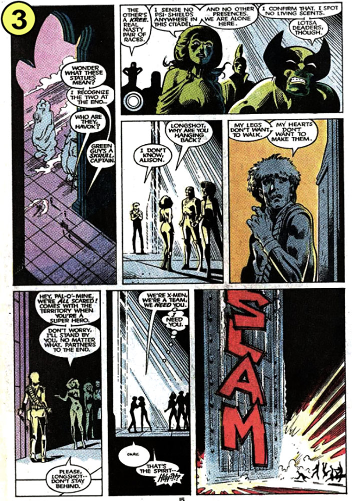
Panel 1
Davis here uses a vertical panel to great effect, emphasizing the lofty height of the doorway. The tiny figures’ long shadows add to the somber mood, and direct our attention toward the figures, preventing them from getting lost in the scene.
Panel 2
This panel includes dialogue from only Havok, Psylocke, and Wolverine, but Davis takes care to place Captain Britain and Storm just beyond these three. Both characters had open-ended moments in the preceding panels—Storm kissing Wolverine, Britain posing a question—so their silent inclusion here keeps their presence alive in the scene. Leaving them out could feel like they were abruptly shooed back to their trailer after saying their lines.
Still, those two aren’t this panel’s key characters, so Davis subdues them by lowering the reader’s vantage point. This pushes Havok higher than Britain in the panel, and Psylocke and Wolverine higher than Storm, giving the three speakers a visual prominence they wouldn’t have had in an eye-level shot.
Managing characters’ visual presence in these ways is important to good cartooning, especially in a book with numerous key characters.
Panels 3-4
This dialogue between Longshot and Dazzler could have played out in a single medium shot, which would have been faster to draw. But by dividing it into a long shot and then a close-up, Davis is able to increase the emotional intensity of Longshot’s performance.
Given the stark lighting here, it would feel appropriate (from a drawing standpoint) to bury Longshot’s face in heavy shadow. But this would have robbed us his fearful expression, so Davis instead grants him plenty of light, relying on his colorist to add appropriate but less occlusive shading.
Panels 5-7
These three panels offer a wonderfully effective moment of the door slamming shut. The final panel occupies only a small fraction of the page, but you can almost hear the echo of the massive door striking the floor. This is due to the quietude of the preceding panels, and the size-disparity of the door and the figures.
Davis’s decision to raise the position of the floor in Panel 6 is especially effective. It allows us to read Dazzler and Longshot’s embrace before reading Dazzler’s final line, which is interrupted by the slamming door. Had Davis located the characters’ feet near the bottom of the panel, all of their dialogue would have had to appear above their heads. This would have inclined us to observe the figures AFTER reading their dialogue, and THEN read the slamming door. Reading the figures after reading Dazzler’s interrupted dialogue would have slowed the slam’s abruptness.
PAGE 4
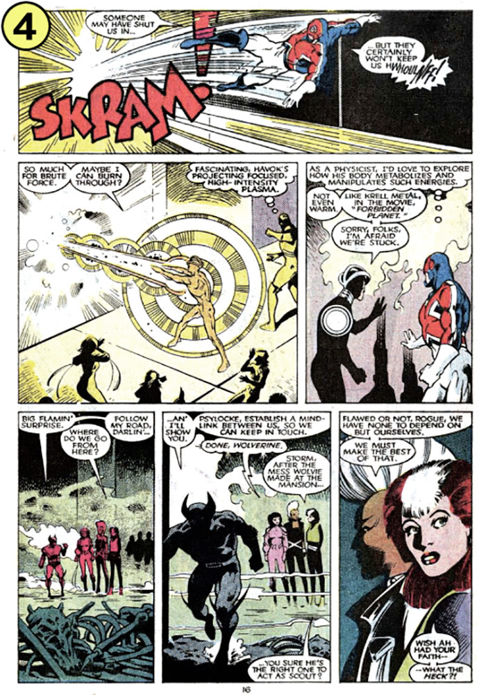
Panel 1
Cartoonists are typically encouraged to stage action in a left-to-right fashion. Davis could have followed this rule by placing the reader on the opposite side of the characters here … but in this case, the characters aren’t trying to move forward. They’re instead trying to backtrack along the route they came. So, Davis properly aims their efforts toward our left.
Panel 2
The brighter a light, the darker its absence. Here, the brightness of Havok’s blast is shown more by the heavy shadows it leaves on the surrounding figures than by the “light lines,” per se.
Sometimes what best sells a drawing isn’t the subject itself, but the effect that subject has on its surroundings. This was one of those times, so Davis took care here to include the other figures, rather than isolating the key figure as he did in Panel 1.
Panel 3
This door is too broad and flat for Davis to indicate its presence in the usual way, with a doorknob or doorframe, so instead he drops shadows from the men’s hands along the face of the door; a simple, effective solution. Without those shadows, it would look as though Havok and Britain were raising their hands toward empty space.
Panel 4
Here we have a common problem. Several standing figures, as seen here, typically require a broad, horizontal composition, but the page’s layout only affords us a tall, narrow panel. Davis solves this problem by pulling back to grant the figures a horizontal band of space in the middle of the panel; he then fills the remaining spaces with a murky mist (above) and a layer of foreground detritus (below). This layering of elements—mist, figures, detritus—serves a dual purpose: it prevents the panel’s empty areas from appearing arbitrarily empty, and it establishes the setting as capacious and threatening.
Storm and Psylocke have no dialogue in this panel, but their inclusion here keeps the group’s presence alive in the reader’s mind, and gives their dialogue in the next panels a naturalness that it would lack had they appeared suddenly in those panels to deliver their lines.
Panel 5
Wolverine’s exit here is tricky. Conventional wisdom dictates that he exit from left to right…but this would make him the last thing we see in this panel—and the women have lines to deliver after his exit. If, however, he exits to the left, it will feel like he’s regressing into the prior panel, rather than moving forward into unexplored territory. The solution: he exits leftward, but toward the reader, at an angle slight enough to avoid the left-exit problem.
The cloud of dust at Wolverine’s feet conveys movement in a more natural way than motion lines could. Davis uses motion lines when necessary (such as when Britain is rebuffed, above), but when possible he will use elements like dust clouds, or trailing hair or clothing, to show motion in a less artificial fashion.
Panel 6
Most of the dialogue in this panel is Storm’s, so one might expect a clear, straight-on view of her face, with Rogue looking away from us on the right. However, this panel’s primary purpose is to signal a challenge Rogue will face on the next page. Davis therefore buries Storm’s face in shadow and in profile (a less intimate angle than straight-on), and turns Rogue’s face toward us and into the light. This grants Rogue’s reaction preeminence, filling us with curiosity about what has grabbed her attention.
That’s all we have time for today, but I hope this analysis has helped sharpen your thinking about the kinds of challenges cartoonists face, and ways to meet them. I encourage you to seek out this issue yourself to read it in full, and learn from a master!
See you here next month!
Carousel by Jesse Hamm appears the second Tuesday of each month here on Toucan!