CAROUSEL BY JESSE HAMM
Carousel 026: Figure-Ground

One of the challenges of drawing comics is that you have to make figures appear to be separate from the environments behind them. This can be difficult, because both the background and the figures in a drawing are made of the same stuff: lines, and the spaces between them. If the cartoonist isn’t careful, a panel can turn into a sort of “Where’s Waldo?” game, in which the reader struggles to find the characters, or to tell where a character begins and the background ends. I often see this problem in the work of inexperienced cartoonists, whose rocks and trees and buildings blend into the figures and clothing, camouflaging everything into a uniform quilt of lines and shapes. It’s easy to get so caught up in drawing things accurately that we forget to grant them depth.
The ability to distinguish a figure from the environment behind it is known as figure-ground perception. We use this ability constantly in life. For example, we use it to discern which faces in a room are people and which are photographs, or which shapes on a tablecloth are objects and which are designs. Figure-ground perception comes easily in real life environments, because our stereoscopic vision alerts us to objects’ depth, and because objects and figures often move, distinguishing them from their inert surroundings. But in a comic, where every shape lies flat and motionless on the page, artists must take special care to ensure that the figures stand out.
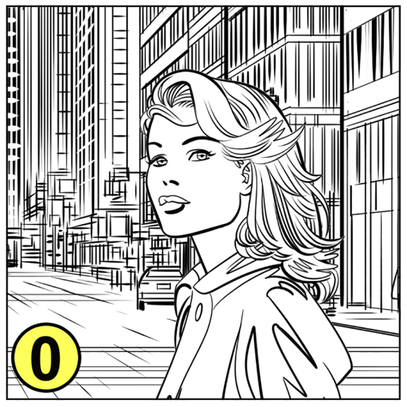
Consider image “0” at right. The lines in the woman’s hair blend confusingly with the windows of the building beyond her, and the busy details of the street scene compete with her face for our attention. Shrunk to the size of an average panel, a figure could get lost in those details, especial if she were turned away from the reader, or if there were more lines on her face. Let’s examine nine ways to avoid that sort of confusion.

1. Empty Space
This is the easiest and most common solution: Simply maneuver your figure into an area where there are no background details behind her head. This way, no pesky details will blend into her face or compete with it for our attention. In most cases, you can leave a blank wall or wide open sky behind your figures’ heads, and arrange any background details well away from where they would interfere with your figures.
However, comics often paint us into weird corners, where events in panels 1 and 3 mean a character must occupy a certain part of the setting in panel 2, leaving us without the luxury of pushing the background out of the way. Such cases demand other methods …
2. Halo Background
Another common solution is to prevent the lines of the background from meeting the lines of the figure. This leaves a white “halo” around the figure which clearly delineates her from her surroundings, and seems to “pop” her forward
3. Lighten Background
If you’re using digital media, a simple way to distinguish the figure is to draw her on her own layer and then lower the opacity of the background layer. This gives the background a pale, murky quality, as though fog or dust has wafted between the figure and the background. (In painting, this technique is known as atmospheric perspective; painters have used it for centuries.)

4. Thin-Lined Background, Thick-Lined Figure
If you are drawing with ink on paper, you can achieve atmospheric perspective by using thick lines to draw your figure (especially the contours) and thin lines to draw your background. This makes the background appear hazy, even though all the lines remain sharp and dark.
5. Heavy Shadow on Background
A staple of comics: heavy shadows! A heavy black shadow behind the figure will pop her forward and clearly separate her from her environment.
6. Heavy Shadow on Figure
An alternative to heavy shading on the background is heavy shading on the figure. Large black areas on the figure can make her stand out from a detailed background. Depending on the scene’s lighting, you could even silhouette her entirely, for a starker composition.

7. Greytone Background
Greytones are a great solution when you’ve failed to think ahead. If you’re perusing some finished art and realize the figure-ground relationship is unclear, the quickest and easiest fix is to add greytones to either the figure or the background. Presto: clarity!
8. Simplify Background Detail
Here I’ve replaced the many signs, windows, and other details of the busy street scene with a simpler tableau, which is less likely to clash with the figure.
This approach is especially useful when the background is a generic setting that you can alter at will, rather than a well-established setting that must remain faithful to past representations. (Your editor will not be thrilled if you replaced the T-Rex in the Batcave with a simple IKEA shelf.)
9. Frame with Figure Elements
Sometimes, a figure carries with her the elements needed to distinguish her from the background. In this case, I’ve simplified her hair and placed some of it alongside her face, which frames her face clearly against the detail of the background. If her hair were cropped short, this function could be served by a hat, or scarf, or hood. (This is also a good reason to keep character designs simple. The busier the character’s hairstyle or jewelry, or the patterns on her clothes, the harder it will be to clearly distinguish her contours from details in the background.)
I hope you’ll find these methods useful, and I’ll see you here next month!
Carousel by Jesse Hamm appears the second Tuesday of every month here on Toucan!