Friday Flashback!
LOGOS …
WE GOT LOGOS …
We take a trip back through Comic-Con’s 44+-year history to take a look at the show through it’s logos, including a peek at some great “Expo Boy” art by cartoonist Rick Geary!
Recently we were looking through some of the logos that Comic-Con has used over the past 44 (!) years of its existence, and we realized how you can see the evolution of the event — plus a peek at it’s one-time sister event, the Comic Book Expo — through these wonderful designs. Beyond that, there’s some great Rick Geary art that hasn’t seen the light of day for quite some time, so we thought we’d share.
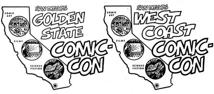
The first two logos from the event. On the left is 1970’s Shel Dorf-designed logo for “San Diego’s Golden State Comic-Con” the first year of the event. By 1972, the name had changed slightly to “San Diego’s West Coast Comic-Con.” Note that both logos stress the core coverage of the event, even to this day: “Comic Art,” “Films,” and “Science Fiction.”
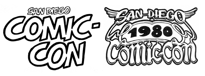
By 1973, the show had settled into being the “San Diego Comic-Con” in 1973. While there was no specific logo until 1980, there was text that was used for a number of years, including 1973 through 1976, lettered by Shel Dorf (at left above). In 1980, this comix-feeling logo was designed by underground cartoonist John Pound and used through 1982.
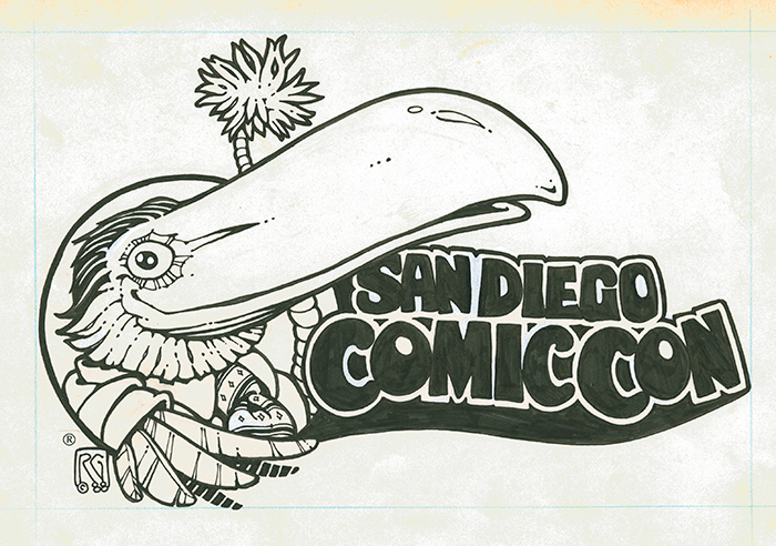
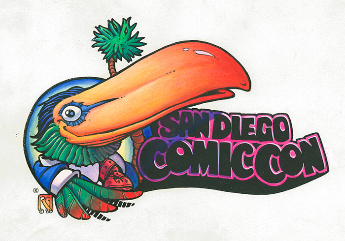
Around that time, Rick Geary came up with the Toucan. According to Rick, he never really meant it to be a toucan; he was just into drawing animals (and birds) dressed up as humans at the time. Either way the bird stuck and became the hallmark of the San Diego Comic-Con for the next decade or so. This is a rare look at Rick’s definitive version of what became known as the “Toucan Logo”. His original line-art is on left and his hand-colored version is directly right.
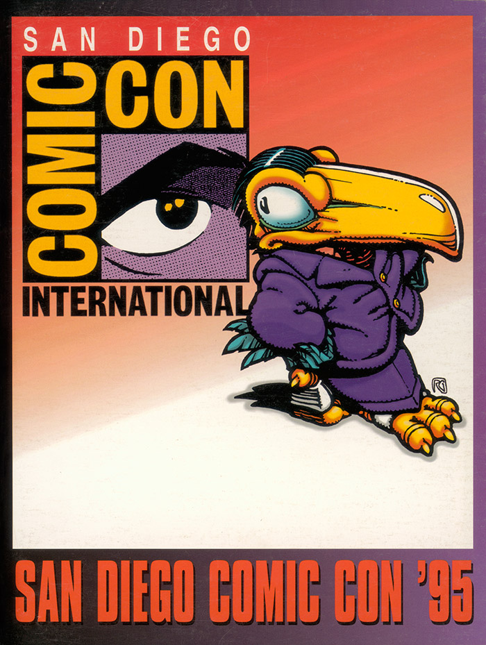
In 1995, in an effort to stress the growing international appeal of the event and its growth to become the leading comics and popular arts convention in the world, the show was rebranded as “Comic-Con International: San Diego,” with this new logo designed by Richard Bruning and his associates. The change was officially introduced with the cover of the 1995 Souvenir Book.
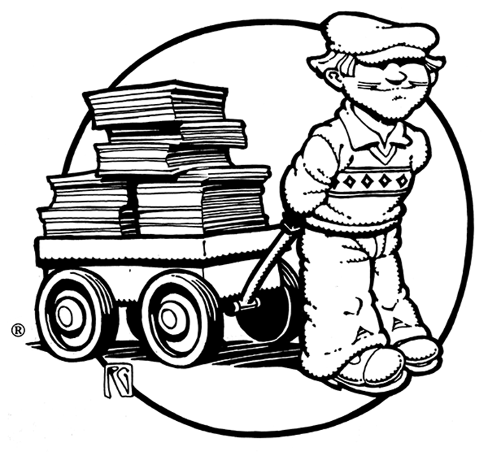
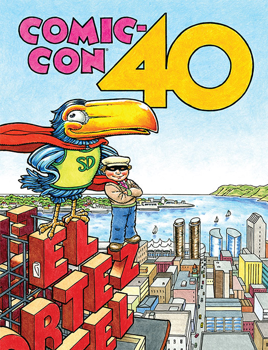
The Toucan gracefully retired in 1995, but came back periodically, including this memorable appearance on our 40th anniversary Souvenir Book cover, along with his faithful sidekick, Expo Boy.
Wait … Expo Boy? Who the heck is Expo Boy?
Expo Boy was our official “mascot” and logo for the Comic Book Expo, a comics industry trade show Comic-Con held from 1984 through 2001. Above, Rick’s first Expo Boy design was the official logo of the Expo, which was open to comic book retailers from around the world, and started by Comic-Con at the suggestion of Marvel Comics’ then director of sales, Carol Kalish. The Expo was run by David Scroggy, who is now Dark Horse’s VP of Product Development.
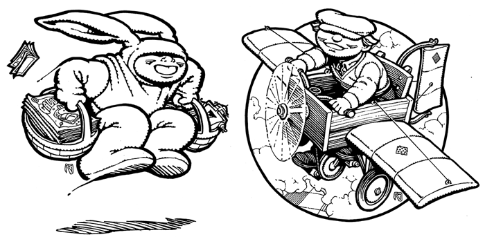
Over the years, each of the Expos had it’s own programming theme, and Rick created new Expo Boy pieces to go along with the original logo, each with their own specific ties to the year’s event, including bunny suit-wearing Expo Boy and plane-flying Expo Boy.
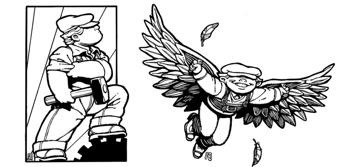
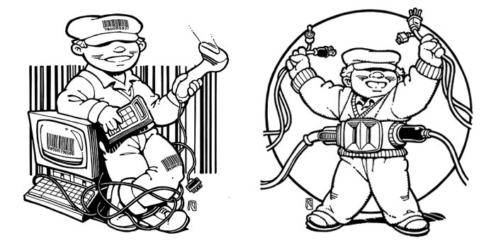
Industrial Revolution Expo Boy [left] and winged Expo Boy [right].
This pair of Expo Boys showcased the growing technological aspects of the comics retailing industry (barcode scanning and connecting to the world via the Internet).
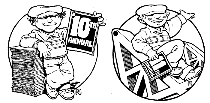
These two Expo Boy designs by Geary took a more promotional show aspect and celebrated the 10th and 11th editions of the event.