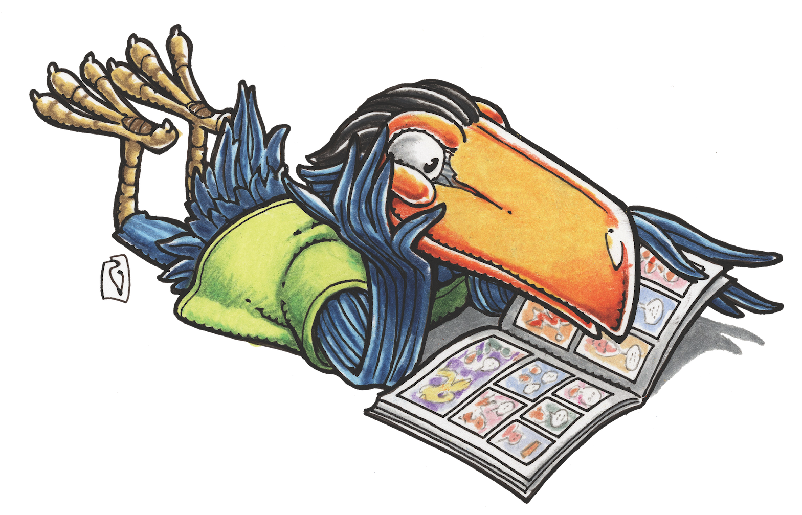
STEVE LIEBER’S DILETTANTE
Dilettante 041: Don’t Do That.
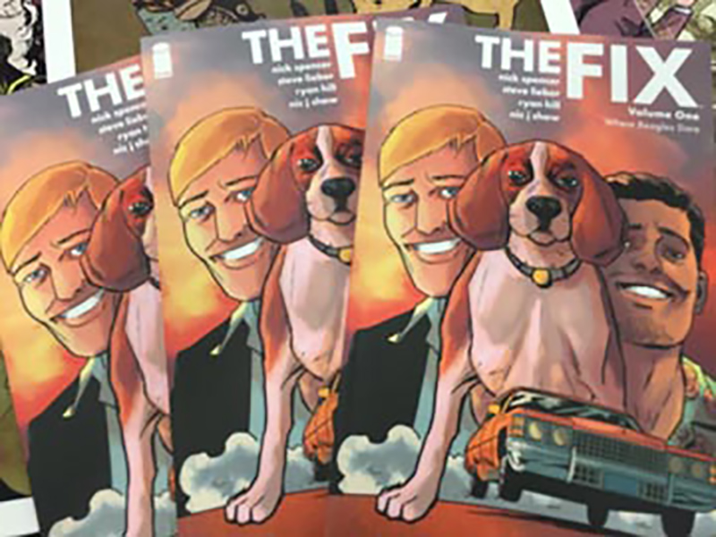
I just completed a feat of marketing I can’t really recommend to anyone: I exhibited at three comics conventions in three weeks. I wouldn’t have done it at all, except that the first trade paperback of my series at Image, The Fix, comes out this week (September 14), and I wanted to do everything I could to promote it. So I did, and after doing three conventions in a row, there’s nothing left of me but hair, skin, and an over-enthusiastic sales pitch.
When I exhibit at conventions, I don’t just show up and talk about my own work. One responsibility I take very seriously is looking at young artists’ portfolios and offering some sort of helpful critique. As an aspiring cartoonist myself in the late ‘80s and early ‘90s, I got great feedback from a number of working professionals while they were exhibiting at conventions. Once I broke in, it was my turn to do the same. I’ve critiqued portfolios for hundreds of artists by now, and I’ve seen recurring patterns. There are certain mistakes, motifs and choices that show up time and time again that make a portfolio feel amateurish. Here are a few of them.
(NOTE: For every rule, there’s an exception. I’m offering this as a list of things to avoid, but I have no doubt that there’s a fantastic, killer, hire-you-on-the-spot portfolio out there somewhere that prominently features every one of these no-no’s. My advice here is general, not specific. Your mileage may vary.)
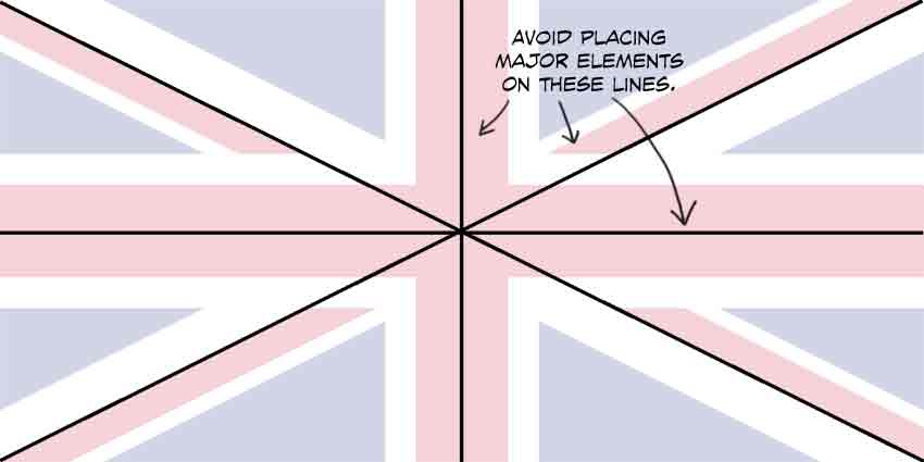
1. Symmetry/ The British Flag
Symmetrical compositions can be tremendously powerful. Use them at the right moments and they add impact and resonance. But the rest of the time they stop things cold. My Kubert School teacher Sal Amendola told our class to avoid placing major panel elements “anywhere on the lines of the UK flag.” Those are the lines that split a rectangle in half, vertically, horizontally, or diagonally. Instead of composing on the half, try on thirds or fifths.
2. The Void
Many amateur portfolios tell stories that take place in a white and foggy void. Are the characters inside or outside? Are they standing on dirt, concrete, or polished marble? Is this the present, past, or future? Maybe the dialogue will tell us, because the pictures sure don’t.
You don’t have to draw an elaborate background in every panel, but if you want to tell stories rooted in specific locations, establish where things take place with an establishing shot, and use that or subsequent panels to show the characters’ relationship to their environment.
3. One-Point Perspective
Once amateur artists learn that stories need backgrounds and environments, they tend to rely on one-point perspective. Much like symmetry, one-point perspective, with every line bursting from the vanishing point, has its place—it forces a sense of dynamism. But as someone who just did three conventions in three weeks, I can assure you that forced dynamism can be oddly tedious. Mix things up; compose most of your panels with two-point perspective, and reserve one-point for a few special panels. You can put the most important thing in a static panel in front of the vanishing point, so all those perspective lines point right at it.
4. Superfluous Detail
Some inexperienced artists try to demonstrate their work ethic by going way, way overboard with inessential detail. They’ve constructed a solid perspective grid, and want to show it by drawing every tile on a checkerboard floor. Every plank of a wooden table is covered in finely drawn woodgrain lines running uninterrupted from one end to another. That brick wall? Every brick is carefully ruled and placed with CGI regularity, and shows none of the wear or weathering that characterize actual bricks.
Use this kind of detail selectively, and design it as part of your composition. Include enough to make your pictures clear and convincing, and place the detail to control your reader’s focus, guiding their eye to the most important elements in the panel. Here’s a clue: if an incidental surface detail adds hours to the time it takes to draw a panel, you might want to look for a different approach.
5. Easy “Exciting” Shots
Portfolio reviews are short. You generally only have a few pages to show an editor or art director that you know how to tell a story effectively. Despite that, I frequently see portfolios that take up half a page with a multi-panel zoom into a character’s eye, or a big close-up of gritting teeth, or a pin-up pose without meaning or context. That kind of stuff shows an artist fixated on empty riffs, rather than the hard work of telling a story.
6. Terrible Lettering
Lettering is a craft that takes time and effort to master. Don’t assume that knowing the alphabet means you know how to letter. If the words are vital to understanding your work, learn how to incorporate type professionally. If not, draw pages that tell your story clearly without any words at all.
7. Unfinished Pages
Nothing screams unprofessional like a portfolio with unfinished pages. When you show your portfolio, you’ve had your entire life right up until that moment to complete the work. If you couldn’t get those pages done over the course of your entire life, how are you going to get your next project wrapped up in three and a half weeks?
8. Going Off-Model/Inconsistent Characters
One of the basic requirements of comics storytelling is that readers don’t lose track of who’s who as they read the story. That means that you have to keep characters consistent. Sometimes this can be particularly tough, as characters may age, or change their clothes or hairstyle as the story progresses.
If your characters’ proportions change significantly from panel to panel in your portfolio or sample, you’re flagging yourself as an artist who can’t maintain basic recognizability.
9. Land of Fake Settings and Props
I see a lot of portfolios that take place in world that looks like a 5th grade stage play. Flat, symbolic buildings, guns that looks like a child’s idea of a firearm, windows and doors that look drawn on the walls rather than constructed into them. Perfunctory props and furniture, thinly constructed without any thought for the needs of the story being depicted. This was unacceptable 30 years ago, when most illustrators needed to maintain their own extensive reference libraries. In the age of Google image search it’s inexcusable.
10. What Is Clothing?
We spend most of our lives looking at fully clothed people, but that doesn’t mean we understand how clothing is constructed, how it drapes across varied human figures, or what a particular outfit says about a character or the situation they find themselves in. If you only show characters that are wearing tights or armor, you’re not demonstrating a basic requirement for most stories.
Have you reviewed portfolios or shown your own? I’d love to hear about the problems you regularly encounter, or those you’ve overcome. Share your thoughts with me on Facebook or Twitter (@steve_lieber).
Steve Lieber’s Dilettante appears the second Tuesday of every month here on Toucan!