MAGGIE’S WORLD BY MAGGIE THOMPSON
Maggie’s World 029: Uncovering Comics


When I was pulling comic books off the rack in 1947 to decide which to favor with my weekly dime, it was the cover that drew me to each in turn. That’s what the cover was designed to do.
But, while I did pull each of those off the rack, the one I would buy was the one that displayed stories inside that would entertain me for the week to come. Because comic books have always been about the stories. Judging a book by its cover? What goes for books goes for comic books, too: The cover doesn’t always represent what’s inside.
An entire essay could be (and has been, I’m sure) devoted to the challenges of creating a comic book cover. The issue has to be easy to differentiate from the preceding issue while maintaining enough of a consistent trade dress to let the casual shopper notice it immediately. And so on.
But what has happened in the field since the 1940s has been an increasing emphasis on covers over contents. Whether you see the graphic on eBay or in a Wikipedia or price guide entry or from an assortment of other information sources, it is—over and over again—the cover that is the focus. In part, that’s because it makes for fast identification and because the copy being shown can be left to reside safely in its bag. Heck, it’s even the covers that tend to bring top prices for original art, no matter how compelling the interior pages of the issue may have been. And, yes, that may be because the cover—designed to attract the viewer—is so compelling.
In his satiric The Eltingville Club last year, Evan Dorkin wrote, “In comics you can judge a book by its cover. That’s how a pro saves time.”
But it’s time to look under that cover.
We tried increasingly at Comics Buyer’s Guide to display a portion of the stories we loved—and were beginning to focus even more on that sort of thing, as we featured information about back issues. Though it’s the back issues I’m talking about here, I continue to believe that it’s still the interior tale that leads us to buy the comic book these days—even though it’s the cover we most often see in advance.
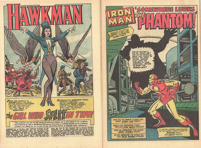
Making a Splash
Interior strategies varied from company to company over the years. The second place the editors tended to place the “buy me” emphasis was often on the first interior page. So some opted for what amounted to a second cover. Was it because comics aimed at older readers were deemed to need more flash? It seems to me in retrospect that it was the superhero stories that more dependably used a follow-up splash. In early days, the page might fill the top two-thirds with a compelling image; eventually, that grew to a full page. You see the cover: That image is cool! You open the issue: Wow, even more cool! (Bonus: Such opening pages also bring high prices for their original art, because the splash page is also designed to be compelling.)
Sometimes, the comic book was even illegally sold coverless. (“It shall not be sold or distributed with any part of its cover or markings removed,” read the fine print on many comics’ splash pages.) Whether the reader found one of those copies or just routinely flipped to that first interior page, the splash was carefully crafted. And, hey! It often took less work to draw one panel than a multi-panel grid. It’s a win-win situation.
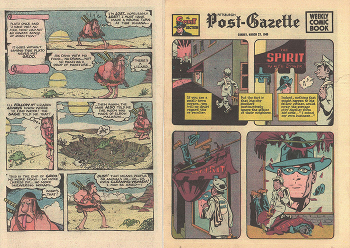
A Different Introduction
As noted, though, not all classic comic book storytellers went for that single-panel kickoff. We take the opening splash panel for granted today, but it wasn’t a universal approach in the early days of comic-book entertainment. The Dell titles, for example, tended to plunge right into the story in a multi-panel grid. In the seven-panel opening page of Dell Four Color #223 (1949), the Museum of Natural Science Third Assistant Janitor ordered, “Today, Janitor Duck, you’ll polish the stones!” How would that set-up capture a young reader? Well, maybe it was the continuation: the fact that, in the seventh panel of that page, Donald dropped one of the “little square rocks”—“And it broke—like an egg!” I just had to read the 31-page epic that followed!
The cover of Tarzan #11 (Sep-Oct 1949) was a simple scene of Boy and Tarzan fishing. It had nothing to do with the issue’s contents. But the five panels kicking off “Tarzan and the Sable Lion” featured Tarzan in an acrobatic (but kindly) duel with Numa the lion: “Full of fight! It would be wrong to destroy him!” And that led into a 24-page story involving: taming and then protecting the lion; meeting, fighting, and befriending Buto Matari; and then the three of them freeing slavers’ captives including Jane, Boy, and the residents of Buto’s village. In short, there was a heck of a lot more action inside than had been indicated by the jolly cover.
In the cases of splash page avoidance, that first page is usually a set-up for the action or comedy to come. And it seems to me to be a far more complex invitation to the reader than a splash page. Because it’s about the story.

Going Deeper
The greatest impact of a comic book tale, however, should come later in the tale than an opening page, because a well-crafted story needs to be a payoff for the cover as well as for the earlier pages. Maybe that’s a discussion for another day; in any case, covering that topic without spoiling the stories under discussion is tricky. In fact, in the two images I’ve chosen here, the small concluding panel of “Master Race” has an impact to which that short story has been building—but it’s not the conclusion. Nevertheless, both pages are, with reason, considered to be classics.
If we were to identify specific comics interiors with a single image, I suppose I’d opt for the first interior page of the issue. But I’d add to that the consideration that the most memorable page of the issue may come later.
If you had to pick your favorite story page of all time, could you pick just one?
Maggie’s World by Maggie Thompson appears the first Tuesday of every month here on Toucan!