JESSE HAMM’S CAROUSEL
Carousel 004: Learning By Comparison
It’s often instructive to compare different artists’ approaches to the same subject matter. Sometimes, this shows how one approach works better than another. Other times, it may reveal two approaches that work equally well in different ways. Or, in some cases, both artists will use the same approach to solve the same problem—revealing, perhaps, that certain problems invite only one ideal solution.
In many media, multiple artists often tackle the exact same subject matter. Portraitists often portray the same popular celebrities; landscape artists often paint the same famous landmarks; musicians enjoy covering the same classic songs. Even films may be remade by different directors. Comics, however, are rarely remade, and seldom give us chances to compare different approaches to the same material. But in the pages below, we find a happy exception.
“Harriman’s Monsters” is an 8-page story written by Greg Potter for Creepy #123 (1980). The story is about a special effects artist who tries to discover the secrets of a more successful effects artist—one “Roy Harriman” (presumably a nod to stop-motion master Ray Harryhausen). In page 2 of the story, below, we see our protagonist, “Danford,” sneak into Harriman’s studio to snoop around. (In the end, he discovers that Harriman’s superb effects are achieved through telekinesis!) Artist Alex Toth was first given the script to draw, but he apparently lost interest after a few pages and rejected the assignment. The script was then offered to Dan Adkins, whose finished version finally saw print.
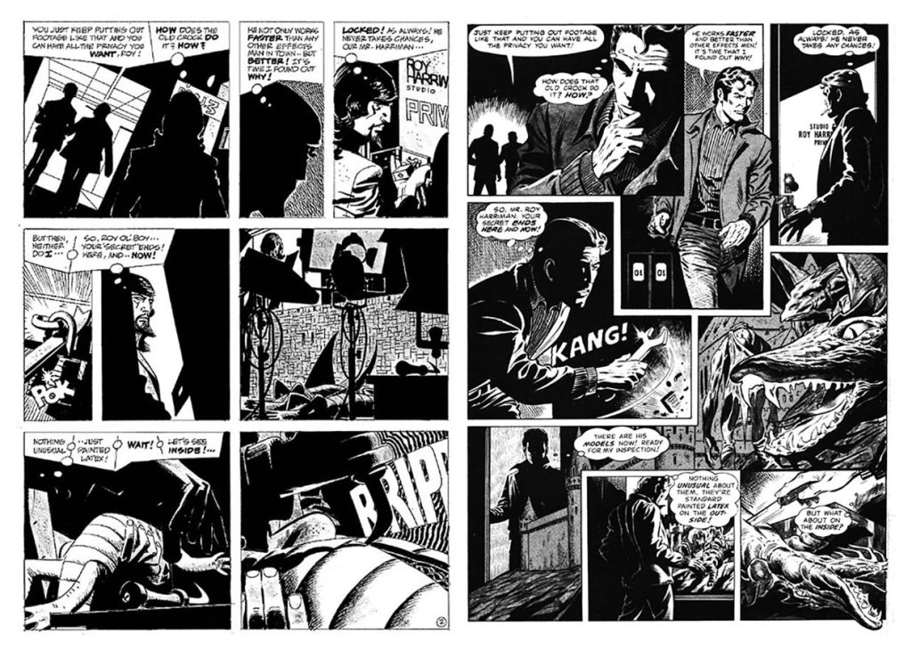
First, let’s consider the choices made by both Toth (above on the left) and Adkins (on the right). They both employ a lot of heavy shadows to suggest a mood that is furtive and creepy (pun intended!). Both artists silhouette Roy and the studio boss in the background of the first panel, because those characters are unimportant to the scene. Neither artist gave us a good look at Danford on page one, but they both show his face clearly in the first tier of this page. (It’s helpful to display the main character’s face as early as possible, so that we readers can supply it mentally throughout the narrative.) In both versions, Roy Harrison’s studio door is labeled, to identify it, but the label is heavily cropped. This allows us readers to feel as though we’ve smartly discerned where Danford is headed, rather than being obviously spoon-fed that information. Finally, both artists generally keep the action moving from left to right, following the standard reading order.
There the similarities end.
The most obvious difference between the two artists’ approaches is the panel grid. Toth uses a rigid, conventional three-tier grid, while Adkins’s panels are uneven, overlap each other, and zigzag around. I find Toth’s approach here more readable, but legibility isn’t always preferable where horror is concerned. Sometimes you want to throw readers off the trail, unsettle them, and evoke a feeling of mystery. Adkins’s crazy layout creates a welcome sense of wandering through some fearsome castle or maze.
Toth nicely showcases the lock in panel 3: centering it in the panel, surrounding it with shadow, and pointing Danford’s beard and wrist at it as he cups it in his palm. But Adkins hides the lock way down in the bottom left corner, far from Danford’s face and the area of highest contrast—a less effective composition.
Adkins’s portrayal of the lock-breaking in panel 4 also strikes me as ineffective. It’s hard to imagine anyone swinging a wrench at a padlock with enough force to shatter it. Toth’s portrayal of the lock being pried apart looks much more plausible. I also like Toth’s choice to divide this moment into two panels. Adding extra panels is often a sign of thoughtless, uneconomical staging, but here I think Toth does it to place the emphasis on Danford’s prying eyes, rather than his destruction of the lock. Toth knows it’s Danford’s curiosity, not his vandalism, that this story is eager to punish.
On the other hand, Adkins seems to better understand the spooky appeal of monsters. I love his juicy close-ups of that dragon. Toth’s limp dolls may as well be Beanie Babies. He gives them Kermit the Frog legs, lays them on their backs, and crops off their faces, depriving them of any sense of life. Perhaps this was an attempt to build suspense? It doesn’t seem enough.
I do prefer Toth’s choice to zero-in on the doll in his 7th panel. This more naturally follows the panel’s narrative focus than the Adkins version, which buries the dragon in the middle distance, and needlessly includes Danford’s head, back, and thighs. Cartoonists too often cram a whole figure or environment into panels which tighter cropping would grant better focus.
Toth wisely sets up panel 8’s knife in panels 6 and 7. When Adkins’s knife pops up in his final panel, it feels unestablished and too convenient. Also, his Danford saws at the dragon rather ineffectually. Toth gives Danford better leverage over the knife and dragon, and his right angles and stark contrast make you FEEL the knife tearing through the latex.
You may also have noticed that the dialogue on each page differs slightly. Toth was notorious for his habit of altering dialogue to suit his tastes, and I assume that explains the discrepancies here. Altering a writer’s dialogue is admittedly rude and unprofessional (and did cost Toth a job or two), but I suspect that in most cases he improved the narrative.
Here, I prefer his dialogue’s punchy rhythms. For instance, in panel 4, I like his addition of “neither do I” as a counterpoint to “never takes chances.” And his use of silence in panel 6 gives the shot an eerie portent.
Overall, I think Toth made more generally effective choices than Adkins, but Adkins seemed to cater better to the specific wants of a magazine like Creepy. In any case, I’ve had such fun comparing the two artists’ approaches that I almost wish Toth had abandoned more stories for others to re-draw. Perhaps, in the future, cartoonists will re-draw old stories as often as singers re-record old songs, and these sorts of comparisons will be all the more common.
See you here next month!
Jesse Hamm’s Carousel appears the second Tuesday of each month here on Toucan!