KATIE’S FIRST DRAWING TUTORIAL!
Carousel 019: Close Read of Batman Year One
Among the best ways to sharpen your grasp of cartooning is to take a close look at a celebrated comic, panel by panel, and observe what makes it work. Batman Year One often appears on lists of the best superhero comics, and it remains—34 years after its debut—a classic of the genre. There are other, more innovative examples of comics storytelling, but none surpass the elegant, sure-footed effectiveness of David Mazzucchelli’s drawings in this book.
Adding to its value as a teaching tool is the fact that Batman Year One was not written by its artist. Like a tennis player returning a difficult serve, or a poker player managing the hand he’s dealt, Mazzucchelli had to work within the constraints of the script he was given. Artists who write their own scripts can solve certain visual problems with a quick re-write, such as by reversing a tricky speaking order, or replacing a complicated background with a simpler setting. But drawing from a script forces the artist to solve such problems in the art. The results aren’t always as fluid as when the artist writes for himself, but the approach does provide a more rigorous challenge, and is all the more impressive when done well. It would be hard to find a better example of this than Batman Year One.
The following four pages are written by Frank Miller, pencilled and inked by David Mazzucchelli, colored by Richmond Lewis, and lettered by Todd Klein. The page numbers are 3-6, but for simplicity’s sake I’ve numbered them 1-4.
PAGE 1
Panel 1
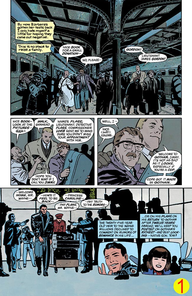
This page starts strong with a busy environment: a crowd framed by the pillars and overhead structure of the train station. After setting the scene with authentic detail, Mazzucchelli is free in subsequent panels to minimize background detail and focus on the characters. We can see some of that simplification begin even here: the train windows near the face of the Hare Krishna disappear, so as not to obscure his profile.
Notice also the heavy black shading Mazzucchelli uses to darken the surrounding crowd. This clearly frames the paler key figures: Gordon, Flass, and the Hare Krishna.
Mazzucchelli also places the panel’s vanishing point right behind Gordon, causing the lines of the trains, floor, and ceiling to converge on Gordon, directing our attention at him.
Panel 2
Here, Mazzucchelli reduces the background to a single pillar and a few silhouettes, discarding the background entirely in the next panel. His reduction of detail is gradual enough to go unnoticed, and aids readability.
In each panel, Flass crosses to Gordon’s left or right, depending on who speaks first in the panel. Mazzucchelli smoothes these transitions by positioning Flass behind Gordon. Were they standing directly side-by-side, Flass’s crossings would appear unnatural.
Panel 3
Here and elsewhere, Mazzucchelli defines the major forms with heavy contour lines (note Flass’s shoulder and the back of his head), using thinner lines for interior details, such as the men’s nostrils and eyelids. Drawing thick outlines on major forms is like capitalizing the first word of a sentence: it aids readability.
Panel 4
A challenge posed by this panel is that we must instantly understand that we’re now at the airport and no longer at the train station, despite the presence in both settings of crowds and luggage. This could be achieved by drawing a plane landing in the background, but that would be distracting. Mazzucchelli’s solution is more elegant: he bounds the top of the panel with a digital billboard like those commonly seen at airports.
The crowd here is again darkened; distracting details like clothing and cameras are mostly blacked-out. This saves drawing time, and directs our attention at the star: Bruce Wayne. To prevent the silhouettes from appearing lazy or obvious, Mazzucchelli uses “semi-silhouetting”: he leaves some highlights on a few characters’ faces and clothing.
Mazzucchelli could have textured the floor with tiling or shadows, or reflections of the figures, but he instead leaves it entirely blank. This prevents our attention from bogging down at the floor, and frees our eyes to glide immediately toward the inset panels at the right. We’ll see him use this technique again on the following page.
Panel 5
Here and in Panel 6, TV-screen-shaped panels are used to suggest we’re following the events on television. (Now that TVs don’t come in this shape, artists must rely on new ways to indicate a televised panel, such as the now-ubiquitous chyrons and station-logos.)
Panel 6
Mazzucchelli is an expert at providing enough detail to achieve a sense reality, but not so much that we become preoccupied with trivial elements. Here, the reporter’s hairdo, earrings, and squinted eyes are distinctive enough to feel authentic, but sufficiently nondescript that we know she isn’t someone we’ll need to remember.
PAGE 2
Panel 1
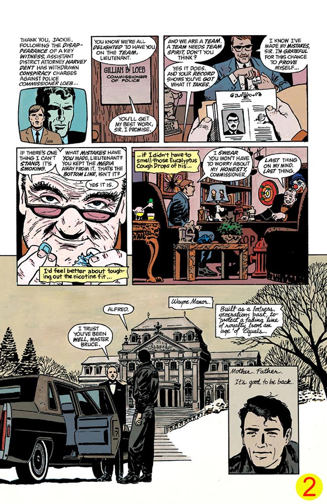
It was uncommon in the ’80s for a reporter’s face to be backgrounded by so large an image; generally, background images would occupy a small screen behind the reporter. But since Harvey Dent will play a role later in the story, Mazzucchelli ignores convention and blows his face up huge.
Panel 2
It’s tempting, when drawing boring panels like this one, to spruce things up with fancy lighting or extreme angles. But such approaches can hamper readability, and look like you’re trying to manufacture drama where there is none. Mazzucchelli is content to let this panel be boringly straightforward, knowing that not every panel must be a showstopper.
Panel 3
We’re not permitted to see Commissioner Loeb’s face in Panel 2, nor this one. This builds suspense for Loeb’s introductory close-up in Panel 4.
Panel 4
Loeb is an unfamiliar character who will play a role later, so his is the biggest face on this page—even bigger than Bruce Wayne’s, whom we’ve met before and will see plenty of, later.
Panel 5
“Set-dressing” isn’t just about the set; it also reveals character. The goofy knick-knacks here suggest Loeb is a man of poor taste.
An angled point of view, such as a down-shot, would have made this scene needlessly complicated, so Mazzucchelli uses a low horizon, placing the “camera” near the floor. This simplifies the clutter, keeping the tables’ surfaces and their contents horizontal.
Panel 6
In contrast to Loeb’s tacky office stands Bruce Wayne’s stately manor. Mazzucchelli opens up the environment here by nixing the panel borders and underlapping the prior panels. Wayne faces away from us, driving our attention toward the manor instead of competing with it. We’ll see his face in Panel 7, so there’s no need for it here.
Panel 7
Mazzucchelli wisely forgoes any detail on the ground, which fixes our attention on the final panel. He trades size for framing: although Wayne’s face here is small, the stark white framing grants it extra importance.
PAGE 3
Panel 1
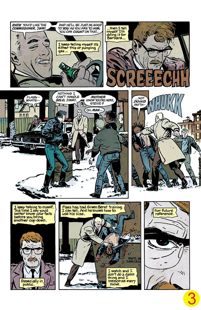
The car’s steering-wheel and A-pillar tell us succinctly that we’re on a drive, without needing a view of the car or the city.
Panel 2
By showing Gordon’s reaction to the car’s sudden stop, Mazzucchelli spares us a redundant exterior shot of the car (which we’ll see in the next panel), while keeping the scene about Gordon.
Panel 3
The “untextured ground” effect appears again at the lower left, leading our attention smoothly from the middleground to the foreground.
As with the TV reporter earlier, the punks are detailed enough to be distinctive (earrings, spiky hair, etc.), but Mazzucchelli resists the temptation to make them so detailed as to be memorable. We should notice and forget them.
Panel 4
This punch is not supposed to be a “hero” moment, so instead of treating us to a big dramatic angle, Mazzucchelli hangs back, giving us Gordon’s unimpressed perspective.
Panel 5
A background here would be redundant, since we can still see what’s beyond Gordon in Panel 3. Mazzucchelli instead uses heavy black, indicating Gordon’s mood.
Panel 6
Though they could easily have been included, the squad car and windowed building are absent from this background, focusing our attention on the action.
Panel 7
This extreme close-up avoids a dull repetition of Panel 5, and shows Gordon’s angry determination.
PAGE 4
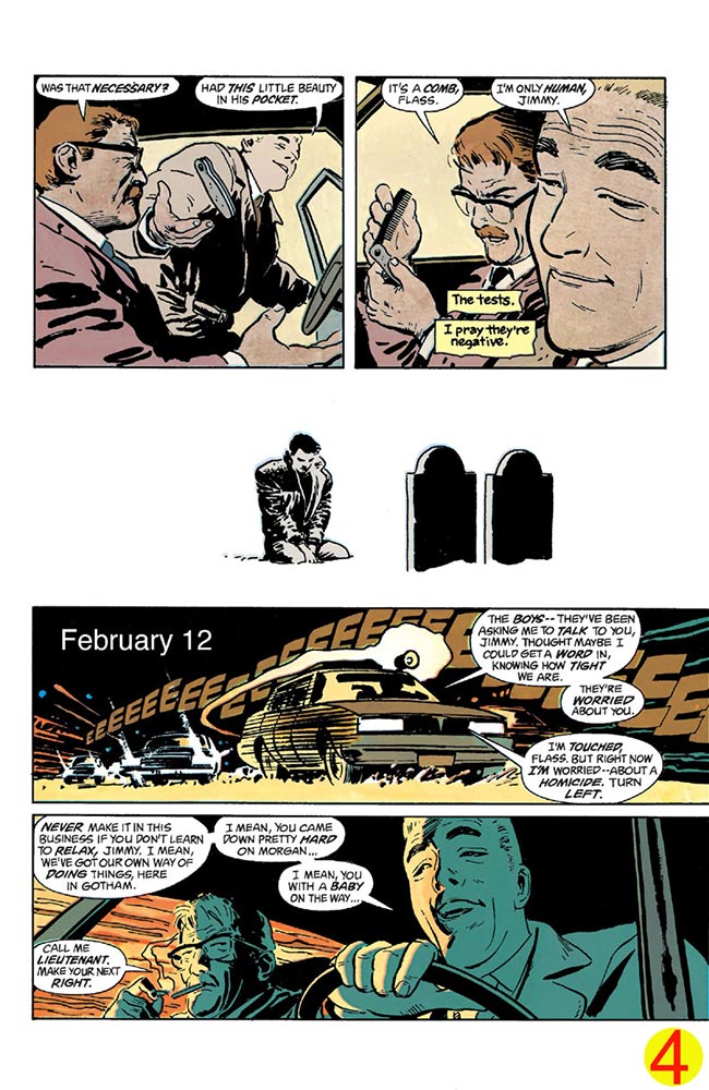
Panel 1
Mazzucchelli does interesting things with the “camera” angles on this page.
In this panel, he lowers our perspective to a level near the characters’ waists. This allows us to see the insouciant grin on Flass’s face as he enters the car: a key detail. A higher angle would have revealed the comb but obscured his face.
Panel 2
In real life, Gordon would probably not lift the comb so high to examine it, but here it must read clearly, so Mazzucchelli brings it up near Gordon’s face, where it will be framed by the open window. He also tilts Gordon’s head so that Gordon’s accusing eye can be seen clearly above his glasses. It wouldn’t do here for Gordon’s eyes to be hidden by his glasses, the way they are in Panel 2 of Page 3.
Panel 3
By removing the panel border and Wayne’s surroundings, Mazzucchelli gives this panel a timeless quality, allowing it to serve as a chapter break and a sort of palate cleanser. Borderless panels are useful to interrupt a page’s rhythm and suggest a change of scene, or the passage of time.
Panel 4
Again the background is minimal. Mazzucchelli could have added some buildings at the upper left, but this would have interfered with the caption. All that’s needed here is a dark night sky and the hint of passing city lights; the cars sell the rest.
Panel 5
Flass speaks first, but since he’s driving, he must sit on the right. This could pose a problem for the reading order: if the two faces were placed side-by-side, we’d be tempted to read Gordon’s line first, or attribute Flass’s lines to Gordon—or Flass’s lines might even cover Gordon’s face. Mazzucchelli solves the problem by lowering our point of view toward the right and angling it slightly upward. This creates a zig-zag pattern: we read Flass’s dialogue, culminating in his face at the upper right, then zag down to the lower left to read Gordon’s face and his reply. This encourages the proper reading order despite the characters’ positions.
Gordon’s bedraggled appearance, as well as his chain-smoking—seen here as he lights a new cigarette with another cigarette—tells readers silently that his first month in Gotham has been a rough one.
Here and throughout, Mazzucchelli’s lines are wobbly and unmet, as though he quickly jotted the scene down after witnessing it only seconds ago. This gives his art a sense of unpolished reality, and a liveliness that feels like it’s moving on the page. With greater care, he could have made his lines more polished and precise, but this would have given them the character of a legal document rather than an anecdote—and stories like Batman’s can’t afford to be scrutinized like legal documents. They need room to breathe.
The rest of Batman Year One is also good, and repays scrutiny. If you haven’t already, I hope you’ll give it a careful read.
See you here next month!