STEVE LIEBER’S DILETTANTE
Dilettante 036: Launching a New Creator-owned Series

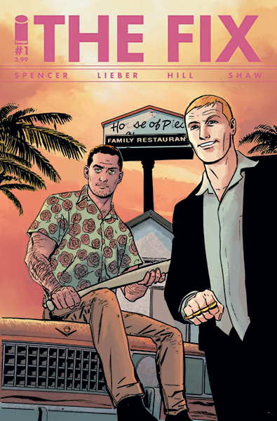
If you keep up with the North American comic book market, you might have seen the most recent edition of Previews, the monthly catalog from Diamond Comic Distributors, Inc. The cover, I’m happy to say, was my work. It was there to promote my new monthly comic from Image Comics, The Fix. It’s co-created by me and Nick Spencer, with color by Ryan Hill, and lettering and graphic design by Nic J. Shaw.
Unsurprisingly, I’ve had a lot of questions come pouring in about the project. I realized that this column would be a good place to offer some general advice while answering them.
SOME of them, at least. The most frequent question was “How did you get on the cover of Previews?” Good question! That’s very valuable real estate we’re occupying. Unfortunately I have no idea how we got on there and as of my deadline for this column, I haven’t been able to get an answer from anyone who would know. I do know that Nick Spencer’s and my last project, Superior Foes of Spider-Man, earned an Eisner Award nomination for Best Humor title, and inspired intense loyalty from its fans—way, way beyond what our sales would indicate. We never sold big numbers, but the people who bought the book liked it A LOT. Maybe that helped? I can’t say for sure. What I can say is this: The most effective promotion you can count on for your next project is your last project. When the time comes to publicize your new project, the first people you want to reach are the ones who liked your last one.
If you’re still working on your first project, you can start to build your audience now by being smart and entertaining on social media. Post art and observations that would interest people who might like the comics story you’re working on. Don’t just plug your own stuff, be a contributing member of these communities.
One of the first things Nick and I did when we started on The Fix was talk about contractual arrangements. We came to a rough arrangement pretty quickly. If you’re starting a new project with a collaborator DO NOT NEGLECT THIS. Friendships and partnerships can quickly turn rancorous if you don’t plan ahead, and the sad thing is that it’s not failure that causes the big problems, it’s success. I know spending a few hundred on a lawyer seems ridiculously expensive, but when you start a comic, you start a business, and you want that business built on a sound foundation.
When it came time to make the actual comic, Nick and I had already worked together on 15 issues of Superior Foes. We had a good sense of each others’ interests, quirks, strengths, and weaknesses. Our collaboration at Marvel was unusual. In addition to complete, tight scripts, Nick can write hilarious scenes Marvel style—giving me a paragraph or two to sum up the major beats of a three-page scene. Or he can write a few pages of hilarious dialogue exchanges without specifying any page or panel breaks. In each case he knows that I like working out those rhythms myself, and that working loose gives me the opportunity to add gags wherever they seem appropriate. I knew from the start what Nick’s scripts are like and how we would collaborate. If you don’t know that about your collaborator, FIGURE IT OUT. Discuss your likes and dislikes and try to head off some problems before they happen. (No matter what, you’re going to run into some.)
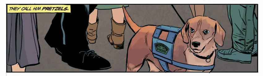
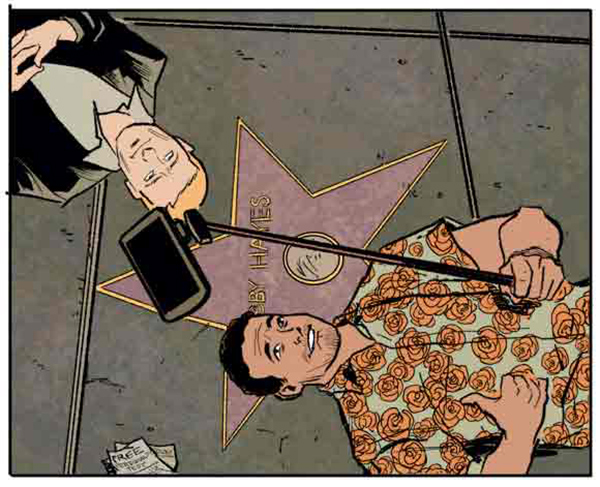
I knew a couple of other things going in. The Fix is about a couple of corrupt police officers in Los Angeles at war with a drug-sniffing beagle named Pretzels.
It’d be a comedy, often farcical and frequently deadpan, but the story might also turn dark. I knew that to create the timing that gets laughs, I frequently need to draw a lot of small panels on a page—often panels where I hold the camera in place, changing only one small element. A setting with regular people and no fantasy elements? Deadpan humor? Lots of small panels? Lots of repeat panels? Everything added up to indicate that I’d be better off drawing the interior of this book digitally in Manga Studio rather than with the traditional method of ink on paper. I miss the feel of a pulling a Winsor & Newton brush across 2-ply Strathmore Bristol paper, and I also miss having original art to sell to fans. But when I’m drawing a whole bunch of little panels, it’s a lot easier on my eyes and wrist if I can zoom in on a panel on my computer screen. Also, drawing on a computer is generally faster for me than working on paper. These are all the sorts of factors you should consider when planning your own next project.
Another important decision was how realistic or stylized my figures and settings needed to be. I knew that a lot of the humor in the book would come from juxtaposing impossibly horrible, sociopathic behavior with utterly mundane people and places. That suggested to me that I needed to avoid getting too wacky in the main narrative. I decided to reserve stylized, “cartoony” drawing for flashbacks and stories-within-the-story. That sort of exaggeration might not work with the story Nick and I are telling, but it could be a perfect match for a story that one of our characters is telling.
And when I say “mundane people and situations” that doesn’t mean “boring and generic.” It means evoking ordinary reality. That means specificity, and the only way to get that is to do some research. I’ve never lived in Los Angeles, so I Google like crazy, and I pump my friends who have lived there for information. I ask Nick or I decide which part of town a scene takes place in and I take a little tour through it via Google Street View. I look for Instagram and Flickr photos tagged with the name of a notable neighborhood landmark. The trick when doing this is not to fall down the research rabbit-hole. I want to include enough specific details to bring a character or setting to life. But I never want to include so much detail that impressive draftsmanship calls attention to itself. I believe that when it comes to humor, anything that doesn’t help the punchline, hurts it.
Color is an important part of The Fix, and this team is very lucky to have Ryan Hill as color artist. Color is, unfortunately, not a specialty of mine. I know when color doesn’t work, but I’m rarely able to offer much in the way of interesting or original ideas about how to deploy it. Fortunately, Ryan Hill is very, very good at his job. My notes to him are generally restricted to clarifying moods or times or minor story points that might not be obvious in my line art.
Nic J Shaw is in charge of both lettering and graphic design. For the former, he chose a font based on my art school teacher Joe Kubert’s lettering, and built his balloons and captions from irregular and rough hewn strokes that blend nicely with my deliberately chunky inkline. For the graphic design, he went in the opposite direction, and made the overall package slick, polished and snappy. The type design feels like the Los Angeles I’m trying to depict.
When you make choices about the art and design in your book, be deliberate. Be clear what you want the whole package to communicate, and make your choices with that in mind.
Once we finished three issues of The Fix, Image Comics scheduled the solicitation, and our team started thinking about marketing. Nic Shaw designed desktop wallpapers, social media icons and headers, and even an Open/Closed sign for retailers
I’ll be mailing out postcards to a list of retailers I’ve been maintaining since 1995, and reaching out to store owners in other ways as well. I’m printing color ashcans with a partial preview of the first issue, and I’m looking forward to handing them out to the retailers I meet over the next couple of months. Essentially, I have two jobs now:
- 1. Draw the comic.
- 2. Tell people about the comic.
Image Comics has very talented publicity people, but they have a LOT of books to publicize, and I’m convinced no one can push a book as effectively as the people who made it. So I’m going to talk it up.
Even if marketing your work doesn’t come naturally, try. If you believe in a story enough to spend a year drawing it, you should believe in it enough to hold a copy in the air and say, “I made this, and when you read it, you’re gonna like it.”
I’m eager to hear your ideas about launching a new project. Get in touch and share your thoughts and experiences! You can reach me on Twitter or Facebook.
Steve Lieber’s Dilettante appears the second Tuesday of each month here on Toucan!