JESSE HAMM’S CAROUSEL
Carousel 011: Close Read: King Tut’s Tomb

We’ve all seen (and sometimes suffered!) critiques of comics pages drawn wrong, but it’s uncommon to find a detailed discussion of pages drawn right. Today I’d like to offer such a discussion—or “close read”—of three pages pencilled by José Luis García-López. García-López is an “Artists’ Artist”—the sort of artist other artists look to for inspiration. The following pages will demonstrate why.
These are from Batman: King Tut’s Tomb, a graphic novel written by Nunzio Defilippis and Christina Weir, inked by Kevin Nowlan, colored by David Baron, and lettered by Ken Lopez. The page numbers are 41-43, but for simplicity’s sake I’ll call them 1-3.
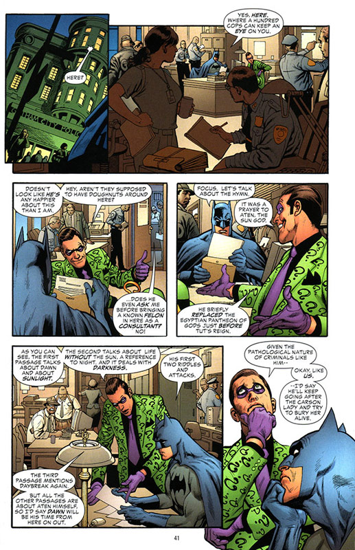
PAGE 1
Panel 1
García-López opens this scene with an establishing shot of the exterior of a police department. He could have cut directly to the interior, but that would have been disorienting (“Where are we? An office … with cops?”), so he first shows us the exterior. To fit both the sky and the street level into this small panel, he tilts the shot (a technique known as a “Dutch angle”). The sky and street level combine to reveal the time of day: the color of the sky indicates evening, but the presence of several pedestrians tells us this isn’t the middle of the night.
Note also the architectural elements: the building’s rounded corner and turret. Among what sets García-López apart are the distinctive touches he uses to bring his environments to life. Many artists would just draw a standard, flat, square-looking building. Some more enthusiastic types might draw a far more ornate building that shows off their skills. But García-López chose one which looks distinctive while still resembling a standard police station. Most experienced professionals practice good draftsmanship, but it’s his casual, judicious authenticity that makes García-López a master.
Panel 2
Here again we see some distinctive, scene-setting elements. Notice the adjustable chair-back on the left, and the lamp on the right. The design of each is unique, without calling attention to itself. Similar effort was devoted to the policemen’s uniforms. On the nearest officer, note the tie clip, collar pins, buttoned epaulette, and pleated shirt pocket. The plain-clothes detective opposite him wears her ID on a lanyard, and although we can’t see her shoulder holster from this angle, the strap on her near shoulder indicates she is wearing one. García-López doesn’t just slap hats and badges on everyone and call it a day; his knowledge of how cops dress is thorough, and he reveals it with a practiced ease which convinces without distracting.
Also notice the planes of depth. In the foreground are the police I just described, followed by Batman and The Riddler in the middleground, and then, in the background, some police at a file cabinet near the far wall. Composing the panel in layers this way creates depth of field, giving the flat page a feeling of three-dimensionality. It also suggests the main characters are surrounded on all sides by their environment, rather than sitting directly before the reader as though on a stage. The effect is helped by the colorist, who downplays the foreground with a dim brown tone, pushing our attention onto the main characters.
Panel 3
Here we cut in close to our main characters, with an aside from Commissioner Gordon. Gordon’s remark is trivial, and we won’t hear from him again, so García-López wisely places him in the far background.
Note the treatment of The Riddler’s hat. Being a dapper fellow, The Riddler would know better than to wear his hat indoors. But holding it would make gesturing difficult (and gestures are important!), so García-López has him set it down on the desk for the scene’s duration. When the scene concludes on the following page, we’ll see him pick it up again.
Panel 4
Here we see The Riddler gesturing again. García-López knows the effectiveness of body language in comics, and always uses it to good effect. He also knows to leave room for speech balloons, so to accommodate the balloon, he pivots The Riddler toward us, and pushes his hands far apart.
Batman is also handled well here. There’s a temptation, when drawing heroic characters doing mundane things, to forget to make them look heroic. It’s easy to draw Batman looking heroic when he’s swinging over rooftops, but many artists draw him looking like a nerd in a costume whenever he’s sitting down. However, García-López never loses sight of the fact that this is BATMAN. Throughout the scene, he uses Batman’s impossibly broad shoulders and dark scowl to remind us that this isn’t just some guy at a desk.
Panel 5
The environment here is thorough but modest; each object is accurate without touting its accuracy. As with the lamp in Panel 1, the lamp in the foreground here is unique but simple. García-López probably thumbed through a furniture catalog to find something just right. He also deftly portrays a copy machine here with a few simple shapes. He includes enough detail to make the scene feel real, yet without attention-demanding clutter, nor any props that are weirdly distinctive.
Panel 6
Here the characters are isolated, with neither background nor panel borders. This breaks up the monotony of square panels, giving the page some variety. It also saves drawing time! And bleeding the figures to the edge of the page allows García-López to push in close without cropping too much of Batman’s neck. You never want Batman to look like a little head in a corner.
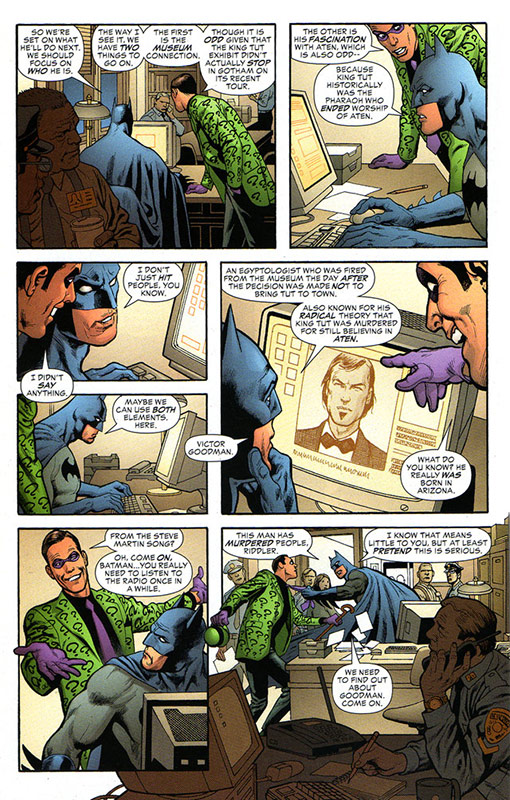
PAGE 2
Panel 1
Here we cut to a reverse shot over the characters’ shoulders. This sets up the computer screen they’re consulting, which will become important during the reveal in Panel 5. But it’s boring to stare at the backs of the main characters’ heads, so this is the only shot where that happens. In the other over-the-shoulder shots (Panels 3 and 5), García-López “cheats” their faces toward us, so we can read their expressions.
He again reminds us of the police in the room, this time with a crusty older detective in the foreground talking to a bespectacled beat-cop over coffee. Age, weight, glasses, coffee—all ways of granting the “background players” some individuality.
Here, and in Panel 2, The Riddler is bending to view the computer, as one would when reading a screen while standing. It’s uncomfortable to bend at the waist without supporting one’s weight, so he rests his hand on the desk. He doesn’t want his other hand to hang awkwardly, so he confines that hand to his pocket. Such plausible weight-distributions add to the authenticity of the scene.
Panels 2 through 5 lack any background, which would be superfluous at this point. García-López has done enough to set the scene by now, so it’s time to jet through the remaining exposition, reveal the bad guy, and move on to the next scene.
He caps off this scene with another bleed in Panel 7, and we move on to Page 3.
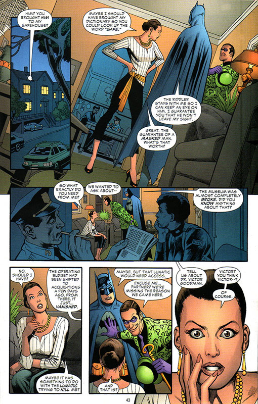
PAGE 3
Panel 1
We’re again treated to an opening exterior shot, but the real interest is in what’s happening indoors, so this exterior is revealed in a small inset. Even here, García-López shows his penchant for detail: the spoiler and roof rack on the car, the garages beneath the houses, the distinctive window pane divisions. Each detail is too simple and trivial to attract undue attention, but they coalesce to create a unique environment, rather than showing us a regular ol’ house on Anywhere Street.
Panel 2
García-López again dutches the angle, in order to fit maximal vertical detail into a relatively short space.
This is our reintroduction to a woman named Leigh Carson, whose importance García-López underscores by framing her from head-to-toe, in the center of the panel. He’s also chosen to position Batman with his back to us, to prevent Batman from stealing attention from Leigh. And he’s turned Leigh’s head into profile, so that the hair-bun she wore when she was previously introduced is clearly visible in silhouette. These kinds of visual tags (Batman’s horns, The Riddler’s hat, Leigh’s bun …) are useful for identifying characters—especially in comics, where the linework isn’t as precise as the resolution in a photograph.
In the background, we see another distinctive lamp, this time hanging from the kitchen ceiling. Typical ways to denote a kitchen include drawing a stove, a sink, and various counter-top appliances: toaster, blender, etc. However, from the angle García-López has chosen here, none of those things would be visible. He solves this problem in two ways: by lining the kitchen walls with cabinets, and by hanging pots and pans from the underside of those cabinets. These elements convince us immediately of the room’s purpose without revealing a sink or any other appliances.
Panel 3
Here we check in briefly with the cops. They’ve been assigned to watch Leigh, and they’re bored: one works a crossword, the other stares glumly into space. These characters’ inner lives are irrelevant to the story, but García-López lets us glimpse their moods because it adds texture and fullness to the fictional world he is creating.
He also reveals Leigh’s mood through her body language. In the first panel, her back is erect, her head thrust forward, her elbows up; she’s angry and it shows. In Panel 2, her mood has softened and she’s ready to listen: she’s seated, and her chin is raised in an inquisitive fashion.
Panel 4
Leigh’s head is tilted, indicating her curiosity as she questions the men. But her earrings dangle opposite the direction of her tilting head; such suggestions of weight and heft are part of what brings the art to life.
Panel 5
More body language here as The Riddler physically pushes Batman aside, reflecting his effort to steer the conversation. Lacking motion, or the sound of spoken dialogue, comics must rely on somewhat heavier physical acting to communicate moods. In this case, The Riddler’s haptic (communication through touch) indicates the vocal emphasis he is placing on this part of their conversation.
And since we can neither hear Batman’s voice nor see his face through his mask, García-López (and his inker) compensate by pointedly wrinkling Batman’s mask to show his raised eyebrow. This gives us the sense that Batman is thinking through the conversation, not just blankly reciting dialogue.
Here, and in the final panel, García-López has dropped out the backgrounds. The setting has been well-established and the characters’ interaction is now the focus.
Panel 6
Here we get the page’s biggest close-up, cueing its emotional climax: Leigh discovering her friend Victor’s role as the story’s villain. Her expression, the placement of her hand, the size of her head, the absence of borders, the highlights in her eyes … it all says, “HERE’S the point of this scene.”
That’s all I’ve got space for, but I hope you’ll seek out this comic or others drawn by García-López, to learn more from his sterling example.
See you here next month!
Jesse Hamm’s Carousel appears the second Tuesday of every month here on Toucan!