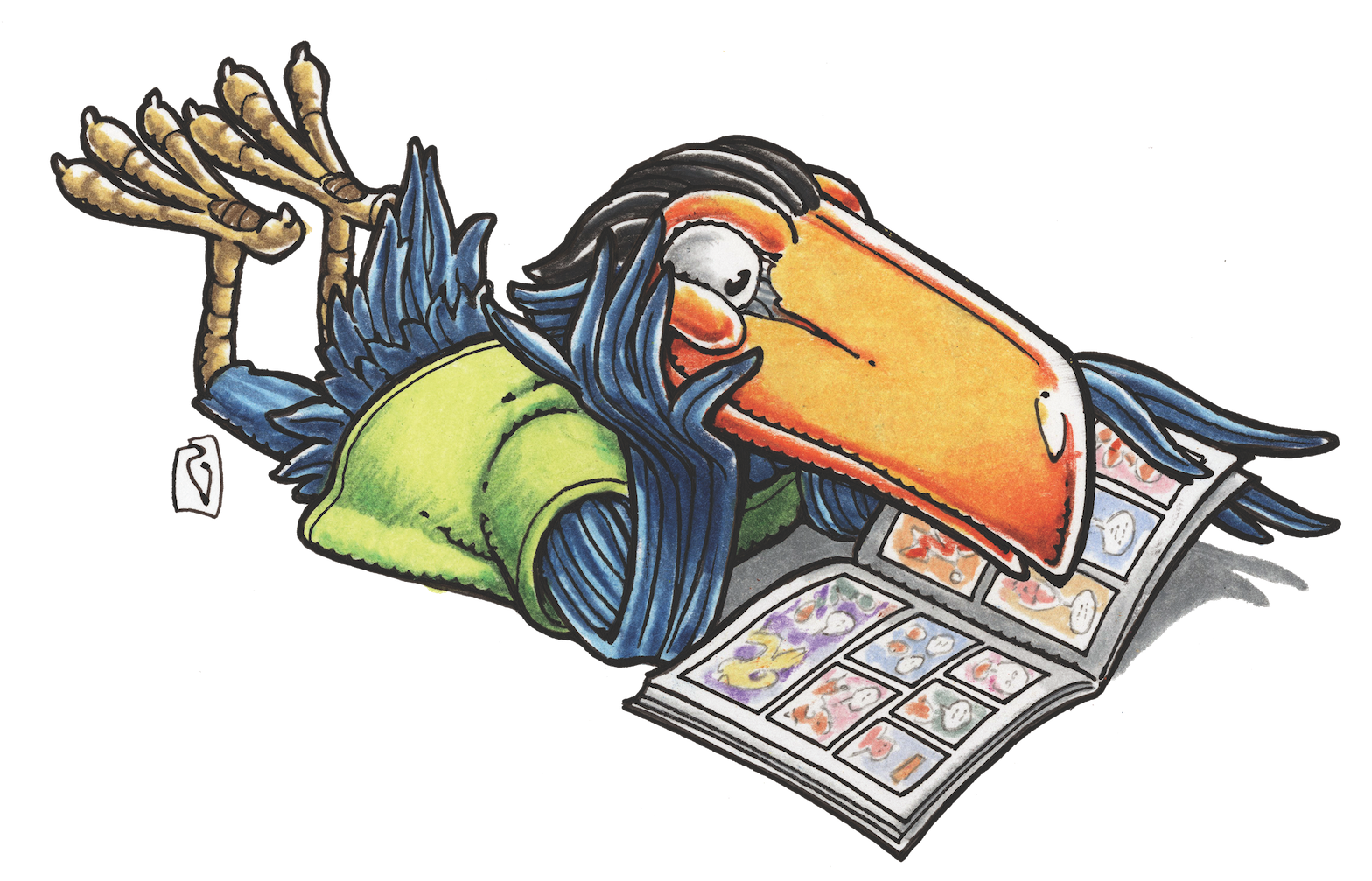
CAROUSEL BY JESSE HAMM
Carousel 032: Cropping Panels
Among the flaws that most often mar the work of amateur cartoonists is poor cropping. That’s when the panel borders either hew too close to the subject, cutting valuable information out of the panel, or fall too far from the subject, leaving information in the panel that’s distracting or irrelevant. I often see in amateurs’ work panels that are cramped and unclear, or that include acres of dead space that do nothing to serve the story. The skilled cartoonist learns to crop a panel wisely, comfortably framing the elements that are important to the story and cutting out the rest.
Suppose your script says that a character in Panel 1 has arrived at a cafe to meet a friend. At your thumbnail stage (see my column on Thumbnails— Carousel 12), you’ve already chosen an angle of view from which to show the action: from over the friend’s shoulder, let’s say, as the arriving character enters through the front door. Precisely how much of each element should be visible? Crop in too closely, and readers won’t be able to tell where they are (a bar? a restaurant? Have I been here before?), or whether the seated character is important. But reveal too much of the surroundings, and the reader may be distracted by the setting and the other customers, failing to zero-in on your key characters. How can you quickly and smartly decide what to include and what to crop out?
Here are four questions that get to the heart of the matter:
- How much must readers see to understand the action?
- How much must readers see to understand the circumstance?
- How much must readers see to understand the mood?
- Is the crop aesthetically pleasing?
Let’s take these in turn.
1. ACTION
This one is rather obvious: you should show enough of the characters’ behavior in a panel to ensure that the reader understands what’s happening. Still, many artists fail to do this! Is the character shooting? Show us her gun. Is he typing? Show us his keyboard! I suspect artists grow so preoccupied with drawing the character’s face or body that they forget to clearly include the character’s actions.
And by “action,” I also mean speech. If characters are speaking, the reader must see what they are saying. For this reason, I recommend adding lettering to the panel before deciding where to crop—even if only a rough pass of words sketched in, to estimate the space the lettering will need.
2. CIRCUMSTANCE
This priority is even more overlooked than action. Artists often forget that in order to understand a scene, the reader needs to know the characters’ circumstances—namely, who else is present and where the scene takes place. As a reader, I often find myself wading through a scene where a character is yelling at someone—but it’s unclear whom! And are they outdoors or indoors? At home or elsewhere? Is it night or day? The artist should have left a broader margin around the key figure to include the answers to those questions: trees, furniture, a sunny sky, other characters, or whatever.
This is also a good time to consider the vertical crop: How much extra space should you leave on the top and bottom of the panel? Is it necessary to see the characters’ faces, the tops of their heads, or their feet? Must we see the ground beneath them, and/or the sky above? Sometimes these elements are needed; other times they may be cropped without losing relevant information. What’s important is that you make that choice deliberately, based on the needs of the scene, rather than letting habit make the choice for you.
3. MOOD
This priority is perhaps the hardest to judge. Sometimes, even after leaving the perfect amount of space to reveal a character’s actions and circumstances, you find the panel isn’t giving readers everything they need for the scene to work. The problem here is that stories aren’t just about events; they’re also about moods. How should the reader feel about what’s happening? The spaces you leave (or don’t leave) around a panel’s key elements will help create the mood you intend.
Suppose you’ve drawn a character sitting thoughtfully at the edge of a meadow. The reader will probably feel that thoughtful mood more strongly if you pull back, revealing more of the pastoral surroundings. You may even strengthen the mood further by including a broad expanse of the starry sky above. Readers won’t need to see more of the sky or the meadow to understand the story’s events, but they may need to see more of those things to understand the character’s feelings.
Alternatively, suppose it’s an action scene: Your hero is hemmed in by enemy forces. Here, it may serve the mood to crop closely on either side of the hero’s face, underscoring his claustrophobia. (To make this crop work, you may need to reposition some of the panel’s key elements, so they’ll remain clearly visible near the hero’s face instead of disappearing beyond the panel’s borders.)
In any case, it’s important to decide what mood you’re aiming for in each panel, and crop accordingly—without obscuring the characters’ actions or circumstances.
4. AESTHETICS
Having considered the other three questions, we come finally to the panel’s composition (a subject I covered in more detail in Carousel 29). Even aside from narrative concerns, objects in the panel should be clearly seen and pleasing to look at.
Our main concern here is a problem known as tangencies, which often occur near a panel’s borders. Tangencies are when the nearness of certain lines in a drawing implies a false relationship between the objects those lines represent. For example, if the line I use to render the back of a character’s head happens to touch the line I use to render the panel’s border, it may accidentally look as though the character is leaning his head against the panel’s border. Or, if the bottom border of a panel passes across the character’s ankles, it may look as though he wading in a puddle, instead of merely being cropped at his ankles by the border.
Avoid tangencies by examining the edges of each panel before inking. Look to see if any odd relationships occur between the lines of your drawings and the panel’s borders. If you notice a tangency, adjust the drawing by pushing the drawn object further into the panel, or further out of it, until the tangency is no longer evident.
This may seem a lot to absorb, but once you grow used to answering these four questions, it will become second nature. When placing their panel borders, most professional cartoonists probably answer these questions without even realizing it. But they are useful questions to ask yourself consciously at the outset, in order to build a strong habit of cropping thoughtfully.
Finally, here’s a drawing method that will make cropping easier: When I’m tackling a new panel and haven’t decided how it should be cropped, I sketch it large, on a new layer, separate from the rest of the page. At this stage, there are no borders; I’m just arranging the objects and figures and ensuring that they’re in proper perspective. Once I like the overall look of the sketch, I place borders at the edges, cropping the art in keeping with the four priorities listed above. Then I resize the panel and fit it into the page where it belongs, stretching or squashing it as needed. I draw the actual pencil art over this rough, adjusting the figures as necessary if I squashed or stretched them. This method allows me to draw freely and then crop freely without having to draw my art into a predetermined space, which can be inhibiting. (When working on paper instead of digitally, you can sketch the panel on a separate sheet, crop it, and then redraw the cropped rough into the actual panel on your comic page.)
Cropping is part of the grammar of comics, like choosing where to end a sentence in a novel, or how long to hold a musical note in a song. Choosing wisely where to crop each panel will strengthen your work and make it more uniquely yours. Embrace the challenge!
See you here next month!
Carousel by Jesse Hamm appears the third Tuesday of every month here on Toucan!