STEVE LIEBER’S DILETTANTE
Dilettante 014: Building the Low-budget World

When I was a teen comics reader in the 80s, I remember asking the owner of my local comics shop (Jeff Yandora of Phantom of the Attic in Pittsburgh) to recommend some other comics like Moore, Bissette & Totleben’s Swamp Thing, Simonson’s Thor, and Chaykin’s American Flagg. When he asked me what I meant by that, the best I could explain was that I thought these were comics that made their own world. I wasn’t talking about “world building” as it’s done in science fiction. I was struggling with my limited vocabulary to identify a quality I saw all these comics as sharing—an authorial voice that made the experience of reading them unique. The manner of telling the story was inseparable from the story being told. (He recommended Love and Rockets by the way, which was definitely the right pick.)
It’s 30 years later; I’ve been making comics professionally for 20, and I find myself facing this question from the other side: what can I do, as the middle person on the comic book assembly line, to give my readers a comparable experience, to tell stories that feel like the way they were told is the only way they could be told. (And let me get a disclaimer out of the way: throughout this essay, I’m going to be citing the work of my betters. I am absolutely not comparing myself to any of them. I’m identifying them as creators who either achieved something I aspired to do, or who did something that I then stole.)
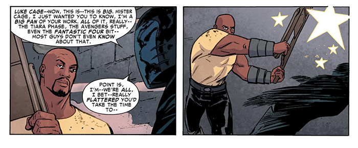
When I accepted Marvel editor Steve Wacker’s offer to draw Superior Foes of Spider-Man, all I knew was that Steve had been very easy to work with on my Hawkeye fill-in issue, and that it was “a ground-level villain book” which probably meant that the naturalistic, low-key Sickles/Mazzucchelli/Micheluzzi/Aja approach I enjoyed so much in that Hawkeye story might be a good fit for this one too. Reading Nick Spencer’s pitch and partial script for the first issue confirmed this. This was a story about the problems of a bunch of unglamorous losers. So that influenced my first decision in finding the visual voice for Superior Foes. I’m going to tell this story with a restrained approach to draftsmanship that emphasizes what happens in a panel over how exciting it is. That means I’m probably not going to have much use for melodramatic Kirby/Buscema/Kane storytelling. Little if any dynamic foreshortening, very few glamorous moments of figures caught in perfect gestures. We want pathos and laughs. Most superhero comics are set up to deliver aspirational power fantasies. No one aspires to be like our leads. A lot of the fun is going to come from showing them to be completely ineffectual.
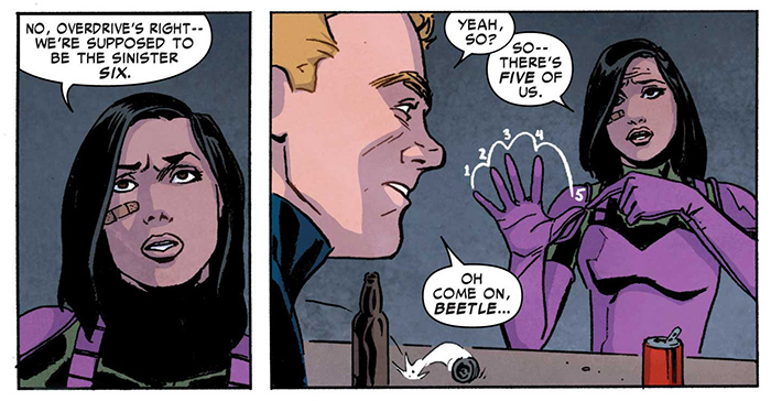
(All art examples: script by Nick Spencer, art by Steve Lieber, and color art by Rachel Rosenberg.)
Nick’s scripts were narrated by Boomerang himself. I knew he was going to be an unreliable narrator. And from the first page, his captions were written as if he was addressing a savvy audience—savvy about fame, savvy about superheroes, maybe even savvy about the fact that this was a comic.
That made me think of the Bob Fosse production of Pippin I watched on video years ago. It was my one of my first exposures to the sort of heavily stylized storytelling that made a point of shattering the fourth wall and admitting within the story that it was a story. The costuming was anachronistic, the sets minimal and symbolic, the characters practically recited each other’s descriptions from the dramatis personae. These were well-established techniques in theater, but to my inexperienced eye they seemed risky. Musicals already put the audience at a distance. It can be hard to get immersed in the stakes of a story when everyone is doing something as unnatural as breaking into song. But instead of pulling me out of the story, the self-awareness drew me in. Doing it that way is a form of flattery, really. “Look, we know you’re not some gullible rube; we’re not gonna try to put one over on you.” It can make you feel like you’re on the same side as the storyteller. Oddly enough, that’s exactly the feeling that some con men try to create in the their victims. Hmm …
I wondered if I could match that approach with my pictures. That play emphasized that it was a staged musical. Maybe I could use storytelling devices that emphasize that this is a comic.
Nick’s script was dense with dialogue exchanges and called for a lot of panels on the page, so I knew that various comics shorthand techniques would be doubly useful. Along with matching the tone of Nick’s captions and story, they’d allow me to cram a lot of information into some very small panels. Sound effects that clarify action and provide humorous punctuation? Absolutely. Thought balloons with pictures? Sure. Diagrams? Self-conscious graphic devices like stars? Yep. Drastic style changes? Go for it. Don’t worry if it might seem corny in a serious superheroic context—they work in old comic strips, and in alternative comics like those of Chris Ware and Jaime Hernandez. There’s an enormous toolbox. Just pull something out and see if it works on the page.

I started blocking the pages out and I was happy that so far, they did. I shouldn’t have been surprised. There’s an illustration client of mine who does theatrical design: Michael Curry. If you’ve seen The Lion King on Broadway, you’ve seen his work. The most important thing I learned working for him was not to try to impress viewers with the illusion of reality. They’ll get more out of a well-designed abstraction than any attempt at faking reality.
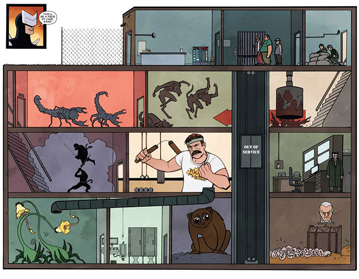
Again, this meshed well with the purely practical choices in my layouts. If every panel on a ten- panel page has a detailed background, the page could get cluttered and unpleasant to look at. If impressive panels stop the viewer’s eye at the wrong time, our carefully paced gags are going to fall flat. Far better to look for places to stylize and reduce the number of elements in my settings. A few lines to depict the right detail or symbol will work better than an acre of elaborate adventure comics draftsmanship.
This dovetailed with another feeling I had about the book—it should feel “low budget.” If this story was a movie, it wouldn’t be The Avengers, with the spectacular effects $220 million dollars can buy. It wouldn’t even be the Ocean’s Eleven remake, with a gorgeous cast of glamorous A-listers. This comic is about the struggles of a broke bunch of C-list losers. Every choice I make in the art needs to support that. I can draw a slick, contemporary superhero costume, but no one in this story is going to have one. I want my cast to look uncomfortable and a little foolish in their super-suits. The characters in Superior Foes are mostly drawn to look like they’d take third place in a cosplay contest.
As the pages piled up, I found that the techniques I was using opened up new possibilities in the storytelling. Nick’s script for the first issue took Boomerang from failure to success as boss of the new Sinister Six. I’d established his problems as a leader early on with this panel.
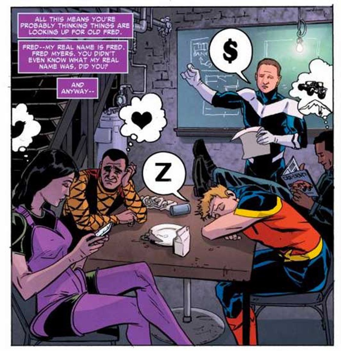
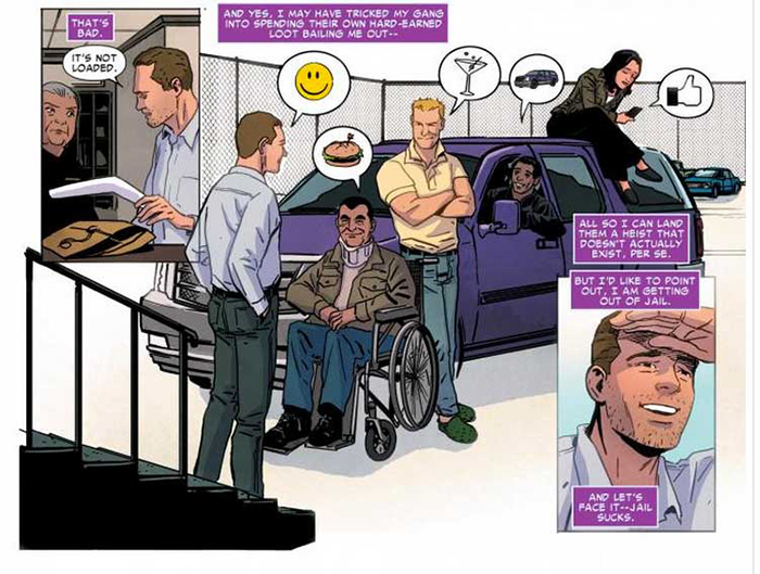
Boomerang is trying to share his plan, but everyone on his team has something else on their mind, which I showed with pictorial word balloons. At the end of the issue, Nick asked for a panel where the rest of the team is there to meet Boomerang as he gets out of prison. I realized I could do a callback to that earlier panel and describe the new status quo using the same tools as before. Everyone’s still speaking in pictorial balloons, but now they show that everyone’s paying attention to Boomerang. And while their individual reactions are still in character, the message is that now they’re functioning like a team.
Ideally this helps unify the story and the storytelling. I want to use the tools available to me to amplify the points the story needs to make, and do so in a way that’s consistent for the world Nick and I and color artist Rachelle Rosenberg are creating. And needless to say, we want to do this while telling a great story and getting big laughs from our readers.
We’ve been lucky to be working with the supportive editorial team of Steve Wacker and Tom Brennan, who have let us try stuff like this. If we’re doing it right, maybe we can make Superior Foes of Spider-Man one of those comics I was looking for way back when- the kind that creates its own world. The first trade paperback comes out February 26; I hope you’ll take a look and let me know if we succeeded.
Dilettante by Steve Lieber appears the second Tuesday of every month here on Toucan. You can find Steve on Twitter at @steve_lieber.