STEVE LIEBER’S DILETTANTE
Dilettante 028: Things I Learned from Benjamin Dewey’s “The Tragedy Series”

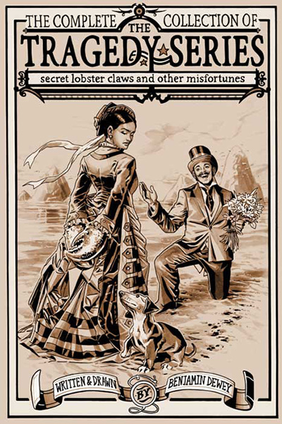
In earlier entries for this blog, I’ve written appreciations of artists like Will Eisner and Al Wiseman, who did some of their most notable work before I was born. With this installment I’d like to talk about the work of an artist who only started his professional career a few years ago, but has already produced an admirable body of work that rewards close reading: Benjamin Dewey, creator of The Tragedy Series.
The Tragedy Series was initially a webcomic appearing on Tumblr. It’s mostly single panel gags with a short narrative caption. It’s sort of like Gary Larson’s The Far Side, but illustrated with lush, painterly sepia-toned ink and wash drawings instead of Larson’s simple, cartooned line art. The gags are set anytime from the Paleolithic era through the Gilded Age, and in an immense variety of settings, including but not limited to mountains, beaches, jungles, opera houses, barber shops, universities, and orphanages. The body of the work consists of 500 “Tragedies” and 26 “Sadness Reprieves.” Each of the former presents some sort of tragic scenario, and these range from surreal to absurd to genuinely poignant. The latter are heartwarming and happy, and offer the reader a fresh eye on some odd but genuinely wonderful moments.
And as a group, they offer remarkable lessons for visual storytellers.
1. Deliver satisfying portions.
In our current environment, it’s crucial both to grasp a reader immediately, and send them away feeling like they got their money’s worth. (And in the free entertainment environment of Tumblr, readers believe that their attention and their recommendations are forms of currency.) Every Tragedy Series installment is self-contained. The reader gets a handsome illustration, a weird, unexpected idea, and a pay-off, even in the single illustrations. There’s no set-up to slog through, no “putting the pieces on the chess board.” In a comics environment cluttered with “to-be-continued” and stories that have gone on hiatus, readers are drawn to projects that deliver a satisfying serving of entertainment every time.
2. Sometimes it’s better to whisper the punchline.
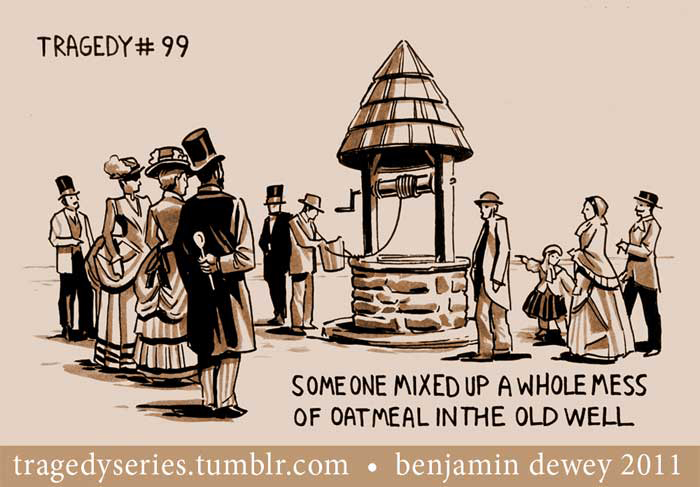
Dewey knows when to go big and when to keep things subtle. Comics are not typically a subtle art, but subtle compositions are often more effective, particularly when the timing of a gag is helped by making the reader take a moment to search for something. Still, artists should note how effectively Dewey staged the crowd at the old well, and used the placement of solid black on the Oatmeal guy’s coat to make sure that readers could find his wooden spoon and pick him out of the crowd.
3. Let your cast reflect a broad audience.
When Dewey casts his scientists, tradesmen and landed gentry, he looks beyond the usual group of Downton Abbey extras. These are fables and allegories and gags, and he trusts that if his readers can wrap their brains around sword-bearing slow lorises and yoghurt-stealing blobfish, or a woman in Victorian finery riding a tortoise side-saddle through a blizzard of butterflies, they’ll probably be okay with that woman having dark skin.
4. Vary your staging.
Even though the individual Tragedy Series images are designed to be read as self-contained units, Dewey takes care to vary his compositions from one panel to the next. Look at these four, each of which involves one subject’s relationship with another. Despite all four frames being the same rectangular shape, each of the compositions has weights and directional thrusts that move the eye in different directions. It’s important to keep your readers’ attention by not feeding them imagery that feels the same over and over. Despite the many similarities from one Tragedy to the next—same shape, same rough size and placement of type, same graphic language of brush marks—Dewey is able to keep his pictures varied and his reader surprised.
5. Let them fill things in.
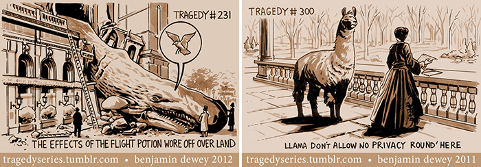
If the audience has to fill in something that’s not in the picture, the picture’s impact increases. Half the fun of the crashed whale (#231) is imagining it happily floating over the city. And there’s a lot of pleasure in visualizing the intrusive llama (#300) continuing to invade the personal space of its poor victim.
6. Keep your tools simple.
As you’ve seen, these are lush illustrations, with plenty of intricate and lovingly delineated detail. But they’re also drawn with remarkable graphic simplicity. Dewey allows himself a palette of black, white, light grey and dark grey. This is the same four-tone palette the master illustrator Howard Pyle advised his students to use in designing their illustrations. (You can see Pyle’s own work analyzed with this suggestion in mind by Andrew Loomis in Loomis’ book Creative Illustration.)
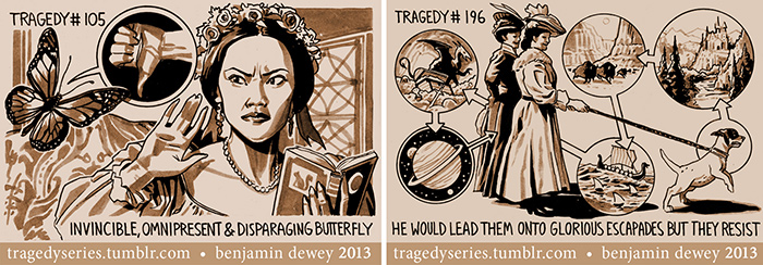
7. Graphic devices can be effectively incorporated with otherwise unstylized illustrations.
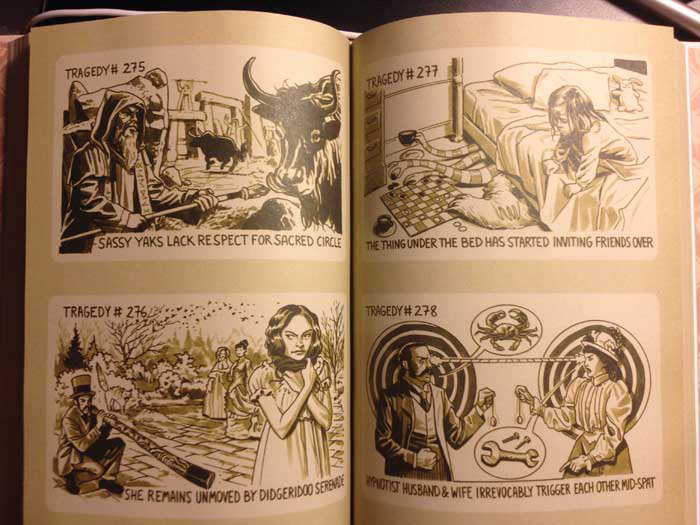
Despite the convincing realism of Dewey’s proportions and rendering, he’s able to incorporate well-designed graphic devices into his pictures without losing his audience. The key, I think, is “well designed.” The disparaging butterfly’s pictorial balloon in Tragedy #105, and the puppy’s plans for glorious adventure in #196, are integral parts of each Tragedy‘s composition.
8. Don’t get hung up on formula.
After dozens of horizontal Tragedies, Dewey drew a vertical one. After scores of single panel gags, he introduced some traditional multi-panel comics. Keeping things fresh while keeping things consistent is the circle that every cartoonist needs to square.
You can still read The Tragedy Series on Tumblr, but if you buy the hardcover edition from St. Martin’s Press, you’ll also get “Lady Excelsior & Friends in the Curious Case of Judgment’s Unblinking Eye,” a sequential story that incorporates several Tragedy characters.
Steve Lieber’s Dilettante appears the second Tuesday of every month here on Toucan!